Usage Guide
Get Started
Thanks for using our theme!
To set up the theme exactly like our demo stores, you may need to install the our free app PapaThemes Widgets. This app provides additional widgets to build the content in Page Builder visually without coding skill.
For displaying your Instagram photos on your website, you can use our free tool PapaThemes Instagram. We will guide you step by step later in this manual.
Customizing Typography, Fonts and Colors
Customizing Typography, Fonts and Colors, Buttons in Page Builder > Theme Styles > General. There are dozens of options to help you customize your website beautifully and uniquely.
Customizing Checkout Page's Typography and Colors
Customizing the checkout page's typography and colors in Page Builder > Theme Styles > Optimized Checkout
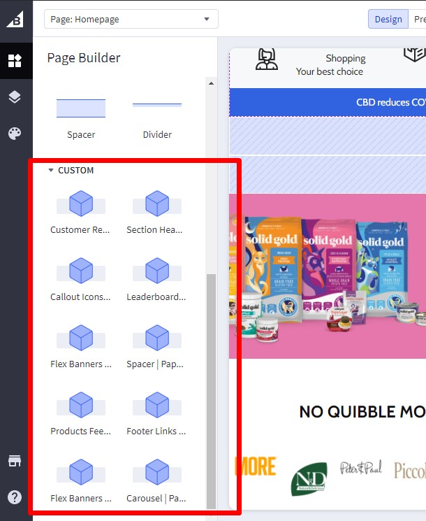
Installing PapaThemes Widgets App
Find and install PapaThemes Widgets app from BigCommerce Apps Marketplace.
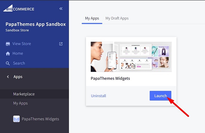
After installed, go to your admin page, on the left sidebar, click Apps > My Apps, click Launch button of PapaThemes Widgets app to open the app:
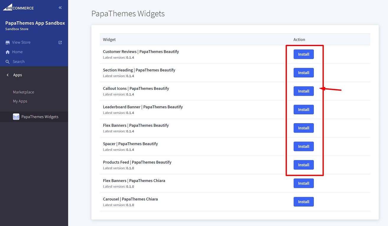
Then click the Install buttons in turn to install all available widgets:
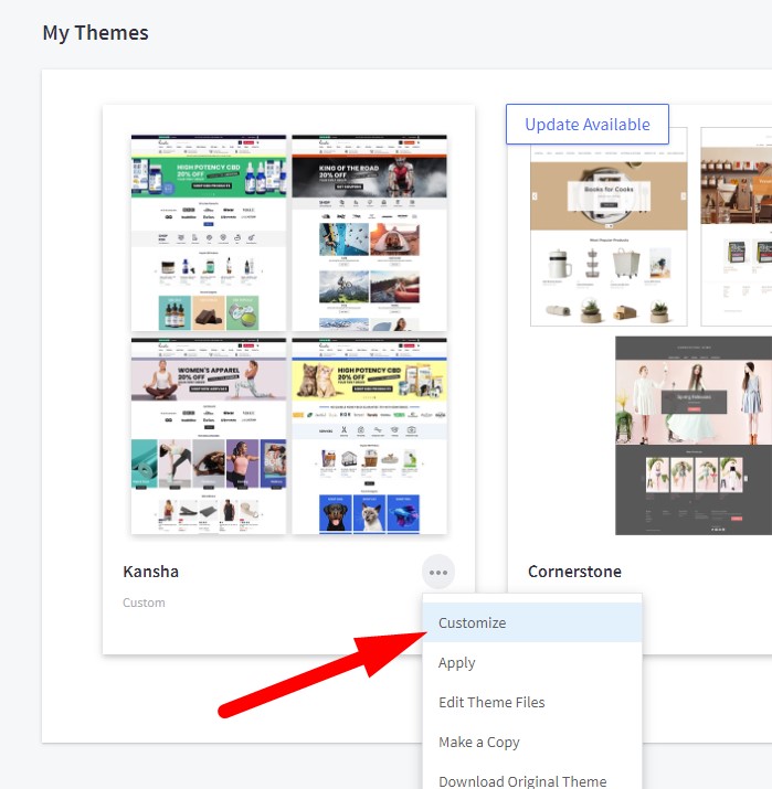
Go to Storefront > My Themes > click Customize in dropdown menu of Kitchenary theme to open Page Builder. Select any theme style to start:
Verify the widgets installed successfully if they appear in Page Builder:
Importing Sample Products
To set up your store to work exactly like our demo stores, you can import sample products using the following steps:
Available Sample Products:
- De'Longhi Stilosa Manual Espresso Machine, Latte & Cappuccino Maker, 15 Bar Pump Pressure + Milk Frother Steam Wand, Black / Stainless, EC260BK, 13.5 x 8.07 x 11.22 inches Product
- Product link: https://kitchenary-cooking-demo.mybigcommerce.com/delonghi-stilosa-manual-espresso-machine-latte-cappuccino-maker-15-bar-pump-pressure-milk-frother-steam-wand-black-stainless-ec260bk-13-5-x-8-07-x-11-22-inches/
- Download: samples/delonghi-stilosa-manual-espresso-machine-latte-cappuccino-maker-15-bar-pump-pressure-milk-frother-steam-wand-black-stainless-ec260bk-13-5-x-8-07-x-11-22-inches.json
Import Steps:
- Go to BC Tools
- Click the Store Manager menu item and enter your store API key
- Click the Import Product menu item
- Select your store as the target store
- Under Product JSON File, upload the downloaded JSON file from above
- Click the Import Product button to import the product into your store

Importing Widgets to Pages
To import widgets to pages (Home, Product, Cart, global regions) in your store to work exactly like our demo stores:
Available Widget Dumps:
-
For Cooking Demo Store
- Download: samples/cooking-bc-widgets-dump.json
-
For Fashion Demo Store
- Download: samples/fashion-bc-widgets-dump.json
-
For Game Demo Store
- Download: samples/game-bc-widgets-dump.json
-
For Pharmacy Demo Store
- Download: samples/pharmacy-bc-widgets-dump.json
Import Steps:
- Go to BC Tools
- Click the Store Manager menu item and enter your store API key (skip if already entered)
- Click the Import Widgets menu item
- Select your store as the target store
- Enter your Channel ID (default is
1if you only have one storefront) - Click the Load Widget Templates button to load existing widget templates in your store
- Under Widgets JSON File, upload the downloaded JSON file from above. After selecting the file, a list of widgets and pages to be imported will appear
- Check "Auto-create new custom widget templates" if you want to automatically create widget templates that are not yet available in your store but are required for our theme
- In the Page List, select the pages you want to import widgets into
- Click the Import Widgets button to import the widgets into your store
- Preview your storefront with pages like Home, Product, Cart, which will look like our demo stores

Setting Up Cooking Style Home Page
To start customizing the theme, login to your admin panel, go to Storefront > My Themes, click Customize button next to theme thumbnail.
Header

To configure the header, click on Theme Styles > Header section, here you can config the header colors, store logo position and size.
User Navigation allows to change colors of the icon phone, cart.
Top Bar section allows to change color of this top bar.
Watch the instruction video:
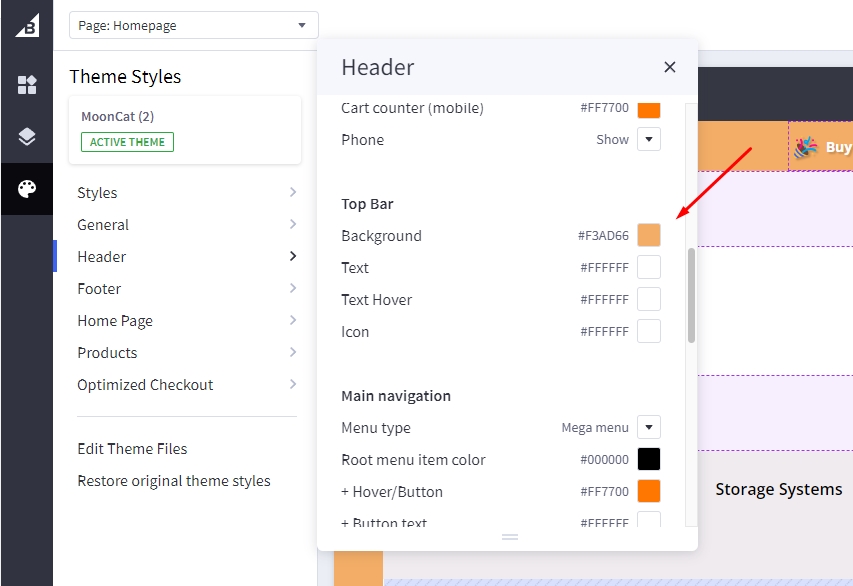
Webpage Outliner

To config outliner of webpage, click on Theme Styles > Header > Top Bar change color of Background to color of your design (exmaple: #F3AD66). Beside the background the theme also allow users to change Text, Text Hover and Icon color on the Top Bar.
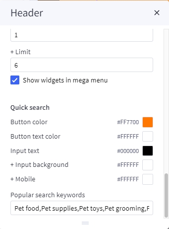
Quick search
Quick Search allows user to change the colors of the search form.
To configure the Quick Search, click on Theme Styles > Header. In Quick Search section you can change text colors, hover, border, and background of the search field.
To change popular search keywords, type your text in popular search keywords field as picture below.
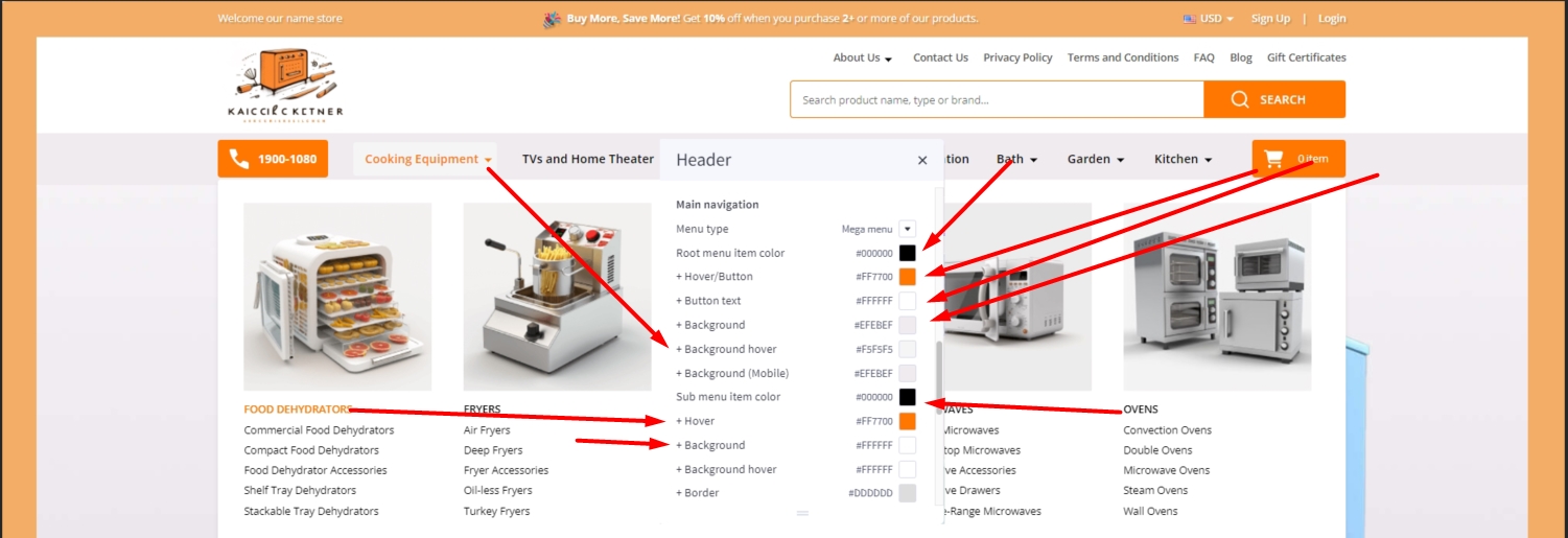
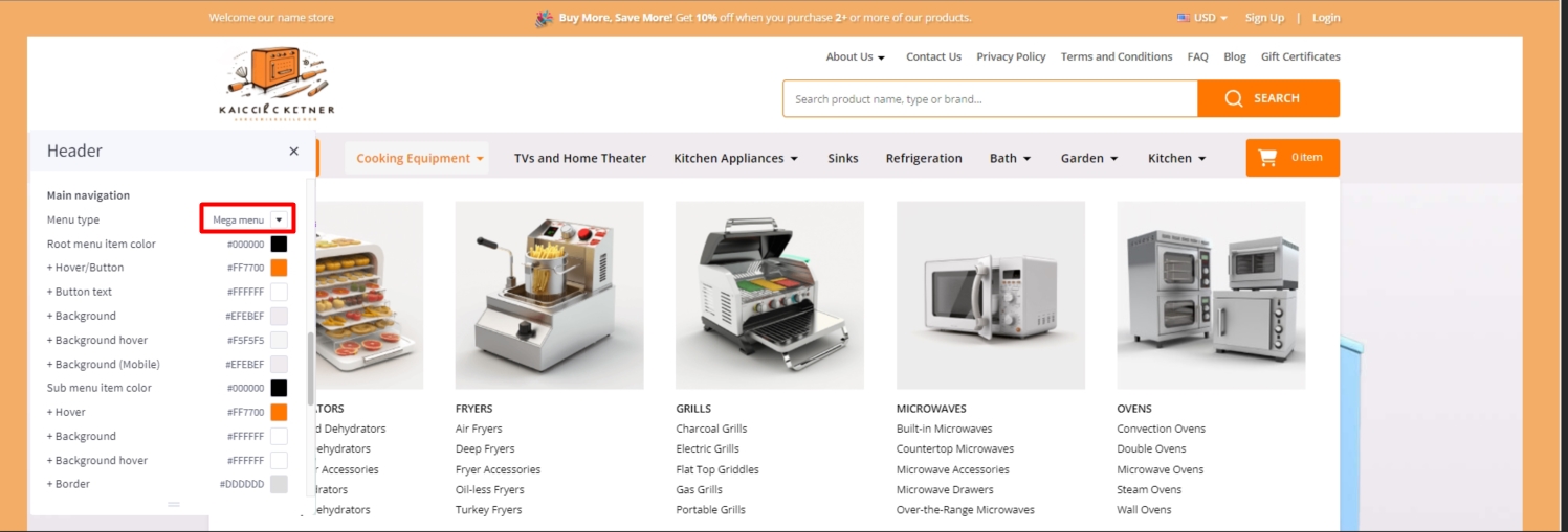
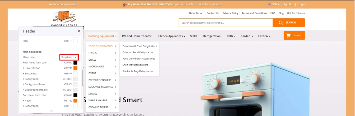
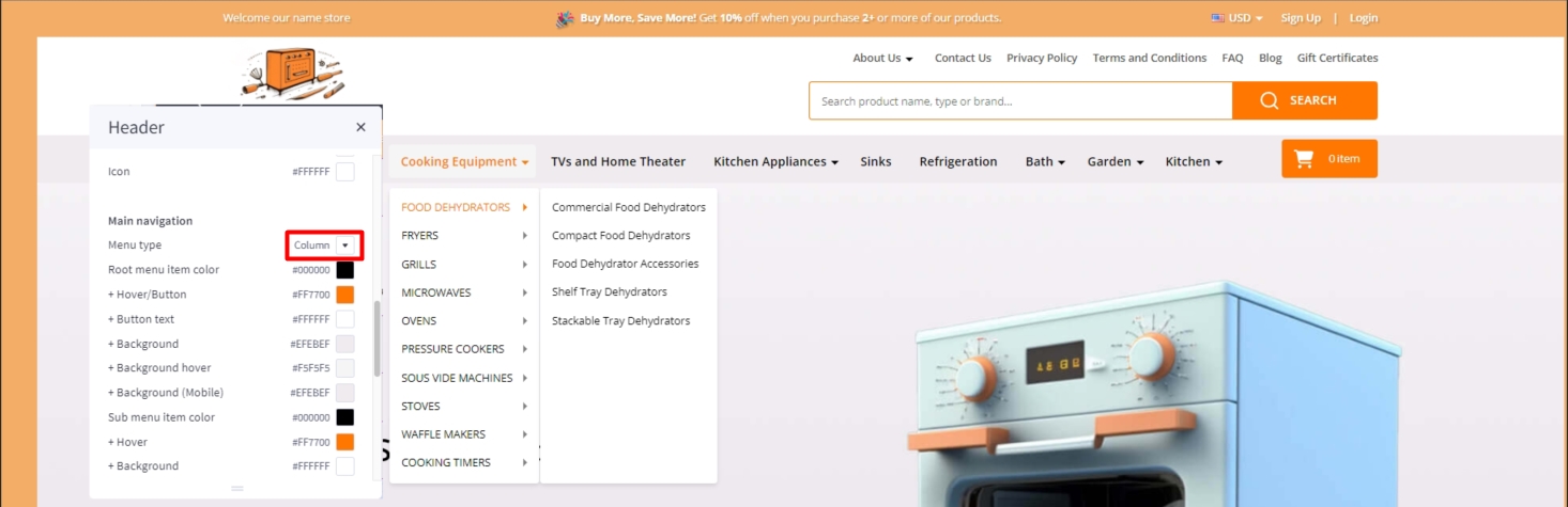
Main Navigation
Main Navigation allows to customize this navigation bar like changing the menu type to column, dropdown menu or mega menu; changing colors of the top menu as well as the sub-menus. There is an option "Hide webpage links" that allows to hide the static web page links on the main navigation.
To configure the Main navigation, click on Theme Styles > Header. In Main navigation section you can change:
-
Root menu item color: text color of root menu item.
-
+ Hover: text color on hover on the root menu item.
-
+ Background: background color of sub menu block.
-
+ Background (Mobile): background color of menu on mobile device.
-
Sub menu item color: text color of the submenu item.
-
+ Hover: text color on hover on the submenu item.
-
+ Background: background color of the submenu item.
-
+ Background hover: background color on hover on the submenu item.
-
+ Border: border-color of mega menu popup.
To config style of main navigation, click on Theme Styles > Header. In Main navigation select Menu style. The theme offer 3 option as below:
Mega menu: show submenu under Mega menu style. Mega menu allow user insert banner and product into it
Dropdown: show sub-menu item as dropdown style.
Column: show sub-menu item as column style.
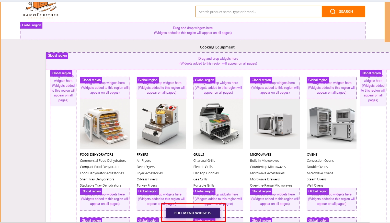
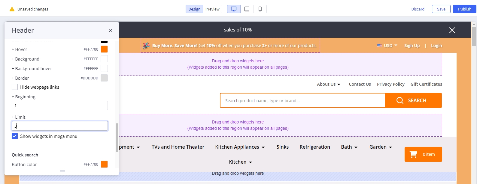
To create banner on Megamenu, in Header find and checked Show widgets in mega menu to show edit menu widget button.
Click on edit menu widget button to open Mega menu in design mode.
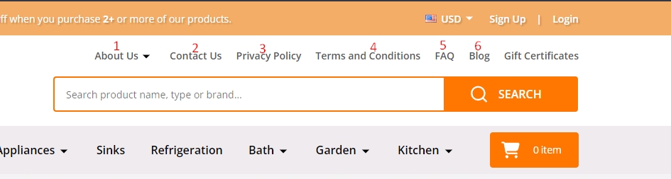
Hide webpage links
To hide Weboage links such as Contact us, About Us, Shipping and return from header, in Themes style > Header Find Hide Webpage links option checked to hide all the links except Categories link.
If you only want to hide some specific links not all the link you can do following step:
+ Beginingfield: input the order link you want to show.+ Limitfield: input number web link you want to show after begining field.
For example: if you only want show Theme Features and shipping & return: - Begining field: 2; - limit field: 2;
Note: the order will only count non-categories link.
Before:
Affer:
Top Banner
Go back to Storefront > My Themes > click Customize button beside the theme thumbnail. You can see the top banner appears above the header. To change the colors of the top banner, go to Theme Styles > General > Top banners section. Here you can change the text color and the background color.
Watch the instruction video:
You can also create top banner by drag and drop HTML widget into corresponding position:
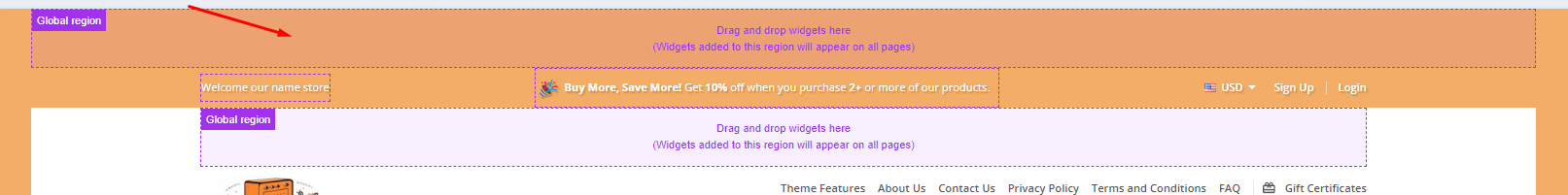
Enter your content inside <p data-marquee></p>.
<p data-marquee>Get a discount with our limited time offer - Use code <strong>SAVE10</strong> for <strong>10%</strong> off your purchase!</p>
<p data-marquee>Dive into our newest collection of eco-friendly products! Let's make a difference together.</p>
<p data-marquee>Discover the beauty of handcrafted artisanal items in our latest collection. Every piece tells a story.</p>
Ad Banner displays on all pages
To display the ad banner appearing on all pages on the header, drag and drop the HTML widget to the corresponding position, paste the given code below to the HTML editor, then click Save HTML button.
<p style="display:flex; align-items: center">
<span style="font-size: 24px">🎉</span>
<span> <strong>Buy More, Save More!</strong> Get <strong>10%</strong> off when you purchase <strong>2+</strong> or more of our products. </span>
</p>
Watch the instruction video:
Main Carousel
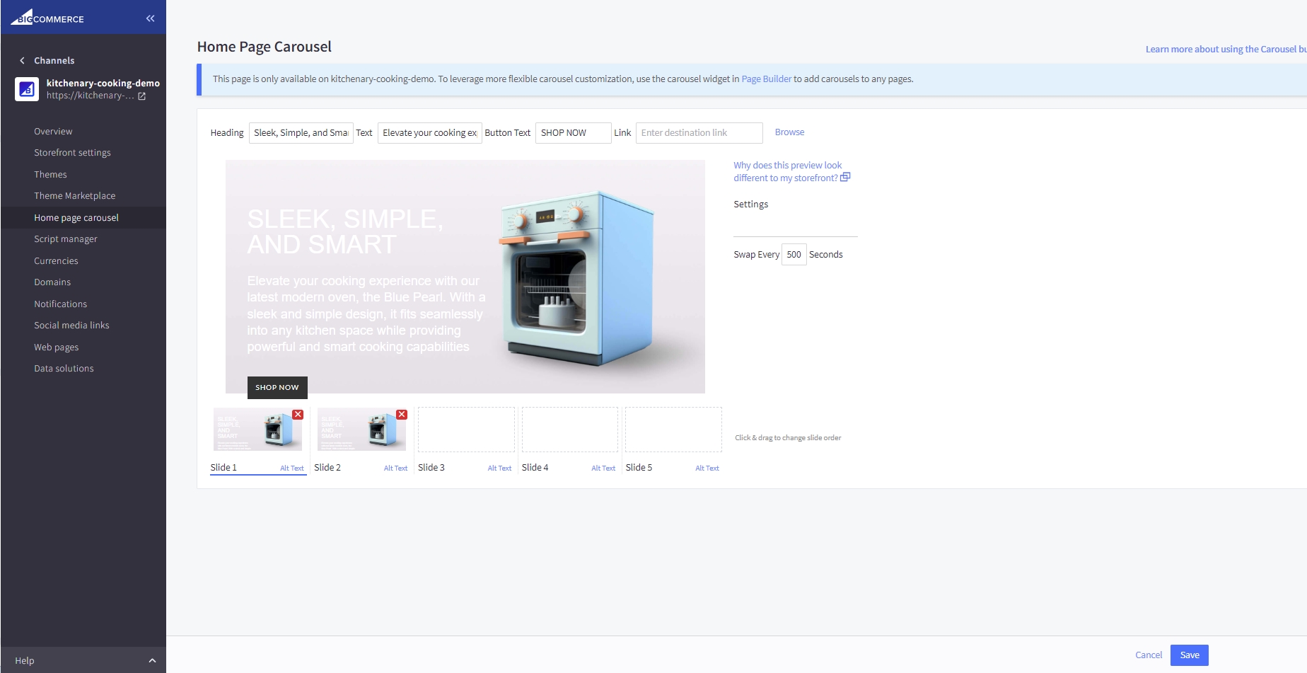
Upload the carousel images in Storefront > Home Page Carousel.
Go back to Page Builder, in Theme Styles > Home Page, make sure Carousel > Show carousel is selected. You can change the carousel styles and colors here.
Watch the instruction video:
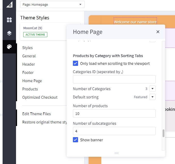
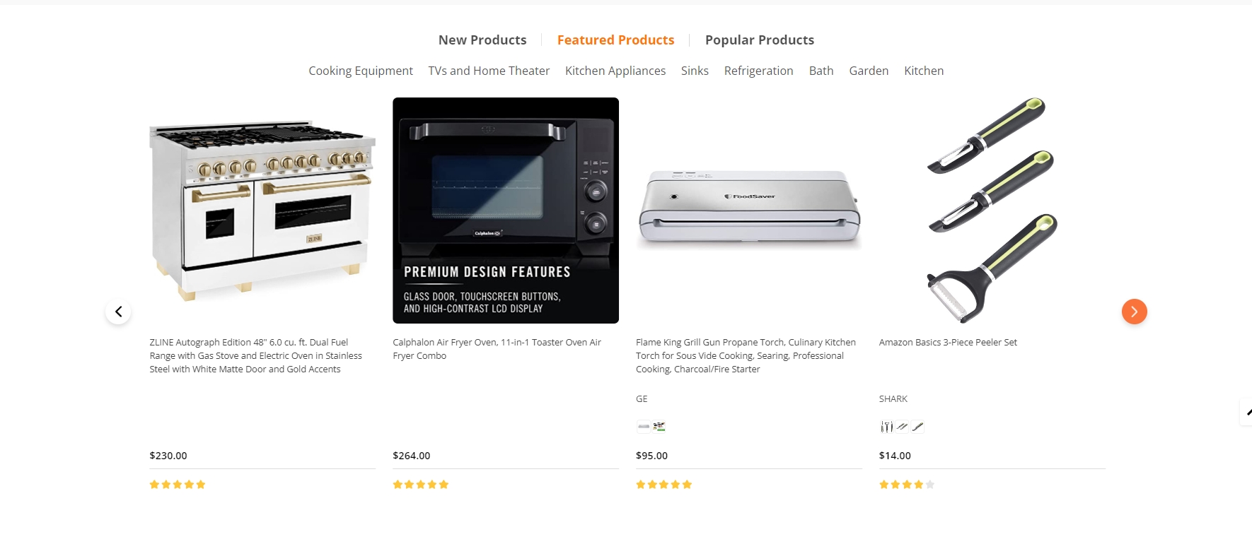
Product By Category
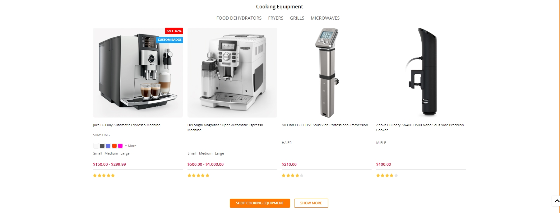
Navigate to Theme Styles > Home Page choose one of the sections and type pbcst to enable this block.
This section allow users to select categories, specify the number of products to be shown, and determine the number of sub-categories to display.
in Theme styles > Home Page find Products by Category with Sorting Tabs:
- Check the box labeled Only load when scrolling to the viewport to enhance site performance. The products in this block will load only when the user scrolls to this section.
- To specify the categories that should be displayed on the Home Page, enter the desired category IDs in the field below Categories ID (separated by ,). Each ID should be separated by a comma. For example: 123,456,567.
- In the Number of Categories dropdown, select the desired number of categories to be displayed on the Home Page.
- Default sorting allows you to control the display of products within categories. You can choose from four options:
Newest,Featured,Best-selling, andTop-review. - Users can also adjust the number of products displayed on the Home Page by entering a number in the Number of products field
- Users can also specify the number of sub-categories to be displayed on the Home Page by entering a number in the Number of subcategories field.
Shopping Guide
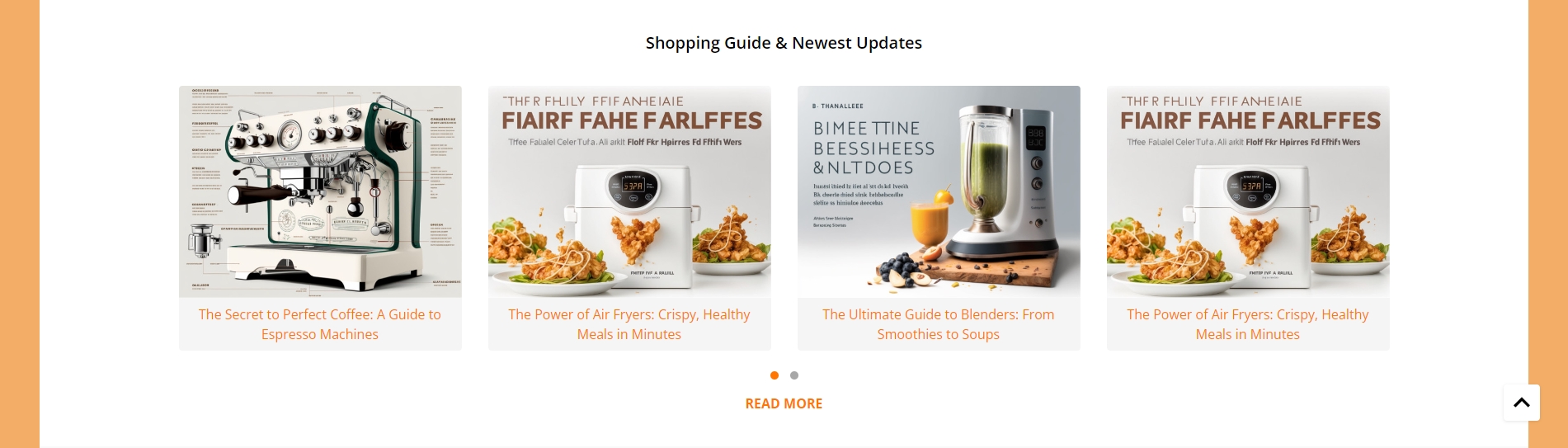
Shopping guide is section that loading content from blogs page. Shopping guide and Blog have the same content and function we advise you should only use one them.
To enable Shopping guide, in Theme Styles > Homepage > Section choose one of sections and type shopping_guide to enable this block.
To change color background of this section click on Background and select color fit to design.
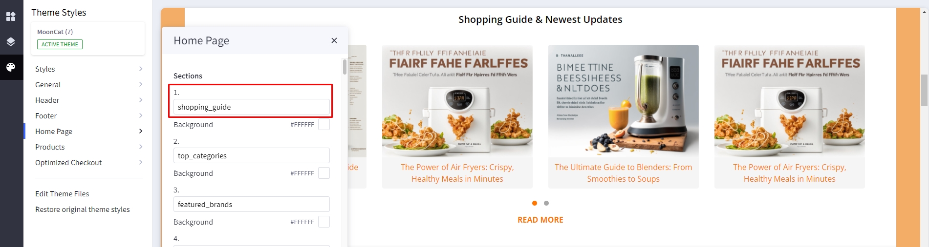
To change tilte of this section, in Hompage find Shopping guide & Newest Update type your text in Heading.
Shopping guide is an upgrade version of blogs section by add quick view modal which help user quickly access information without open new pages. Shopping guide quick view will automatic load all widget that have been designed from blog page.
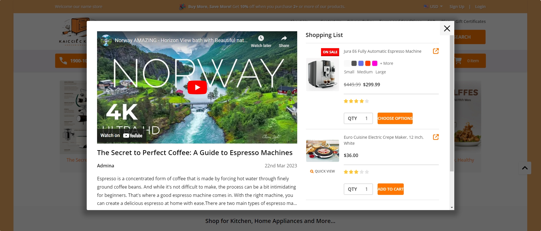
Creating shopping list and other widget in Shopping Guide
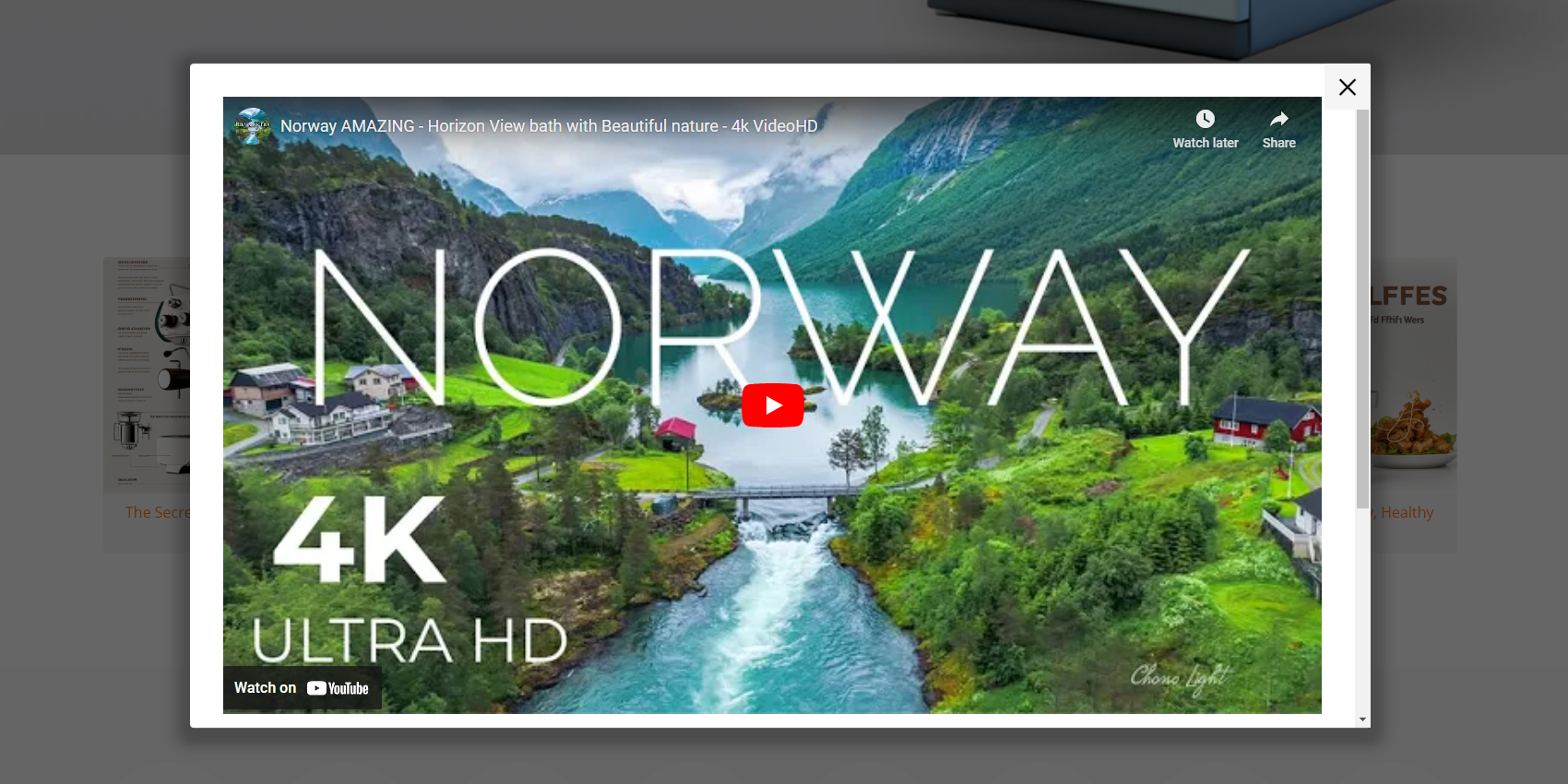
You can replace video widget with other widget you want, in this example we use video widget.
Drag & drop Layout widget to the corresponding position, change Column = 1.
Select Column 1, set Padding = 0 0 0 0.
Drag & drop Video widget into Colum 1. Copy the video link and paste it in the Video URL field.
Save the changes and preview the widget on the homepage.
Creating a widget product list on the blog page:
Drag & drop Layout widget to the corresponding position, change Column = 1.
Select Column 1, set Padding = 0 0 0 0.
Drag & drop Section Heading | PapaThemes Beautify widget into the Layout. Typing your text (example "Shopping List"), select custom in Text style field, set Font size = 20px, Text color = #000000, Margin = 0 0 16 0, Margin (Mobile) = 0 0 16 0.
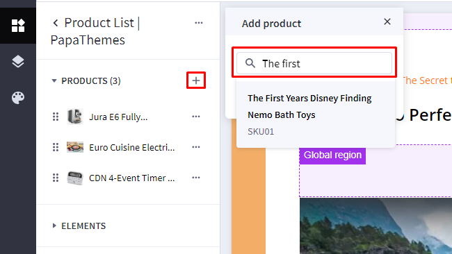
Drag & drop Product List| PapaThemes Beautify widget below Section Heading | PapaThemes Beautify widget. Click on the Add product icon and enter the product name
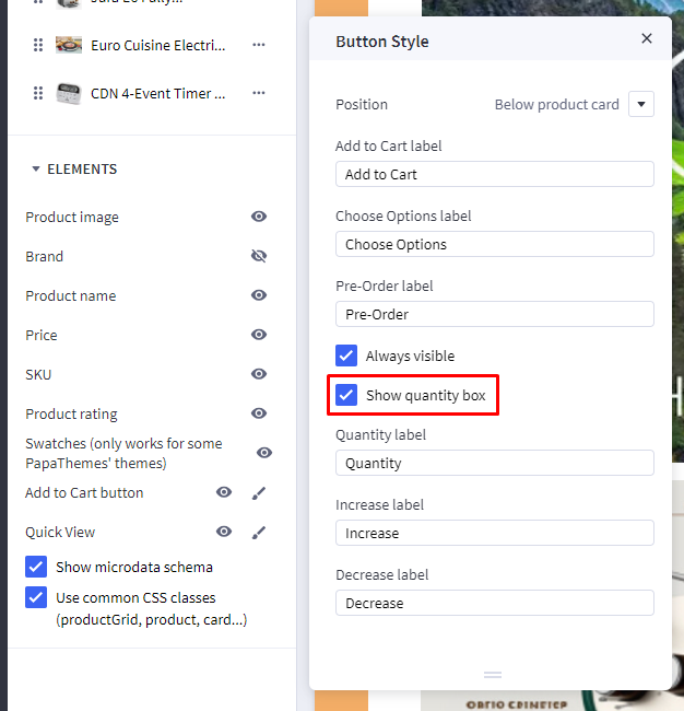
In the Element section, enable the options to display the desired product information. Click on Edit for the Add to Cart button and turn on the Show quantity box option.
Save the changes and check the popup on the homepage.
Featured Brands
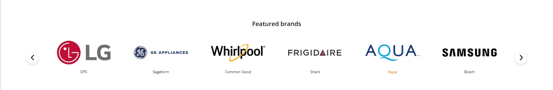
Featured brand will automatic load all brands of your store.
To enable Featured brand, in Theme Styles > Homepage > Section choose one of sections and type featured_brands to enable this block.
To change color background of this section click on Background and select color fit to design.
This section allow user change section tiltle and display/hide brands logo, in Hompage find Featured brand type your text in Heading and checked the Show brand logo to display brands logo.
Top Categories

Top Categories will automatic load first level categories of your store.
To enable Top Categories, in Theme Styles > Homepage > Section choose one of sections and type top_categories to enable this block.
To change color background of this section click on Background and select color fit to design.
This section allow user change section tiltle, in Hompage find Top Categories type your text in Heading.
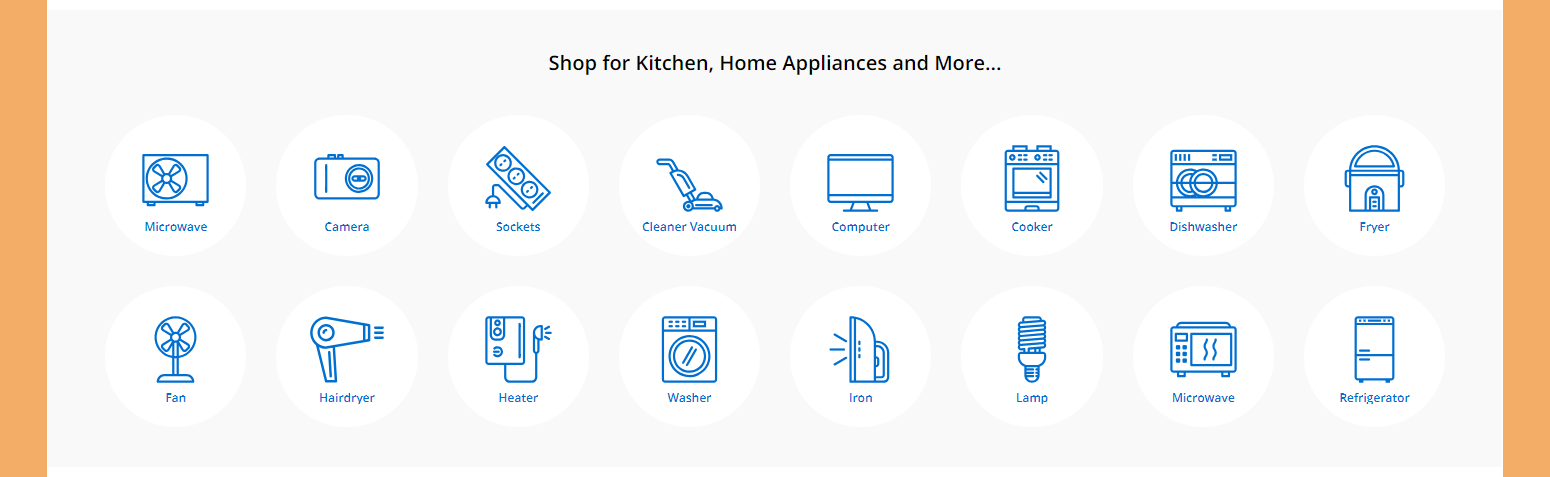
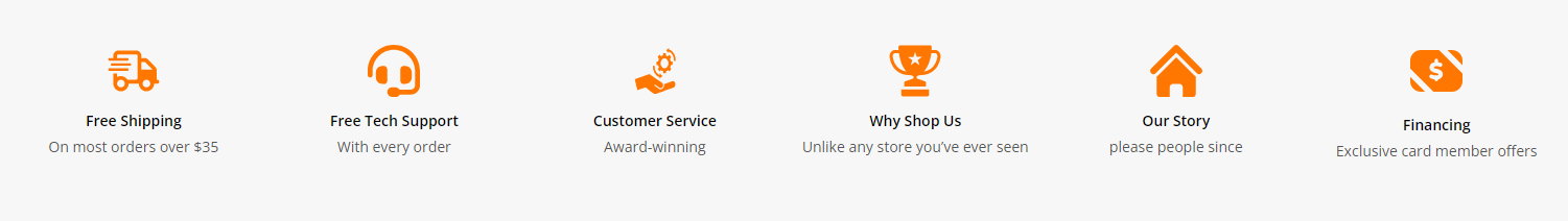
Shop For Kitchen
Drag & drop Layout widget to the corresponding position, change Column = 1.
Select Column 1, set Padding = 0 0 0 0. To change the Background color to #F9F9F9.
Drag & drop Section Heading | PapaThemes Beautify widget into the Layout. Typing your text (example "Shop for Kitchen, Home Appliances and More..."), select custom in Text style field, set Font size = 20px, Font weight = Semi Bold, Text color = #000000, Padding = 40 0 40 0, Padding (Mobile) = 20 0 20 0.
Drag & drop Callout Icons | PapaThemes Beautify widget below Section Heading | PapaThemes Beautify widget. Delete all other callouts except the first one.
Choose the Circle option in the Icon section.
For the Width, select the unit % and specify the values for different devices as follows: Desktop = 12.5%, Tablet = 15.5%, Mobile = 23%.
In the Padding section, set the values for different devices as follows: Desktop = 0 15 30 15, Tablet = 0 8 0 8, Mobile = 0 8 0 8.
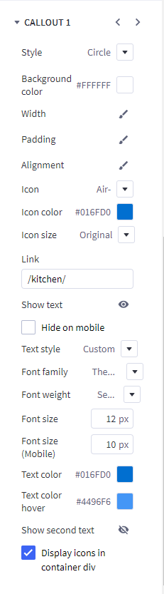
Select your desired icon in the Icon section.
Modify the icon's Color to your preference. Paste the link into the designated Link box.
Select Custom for the Text style. Set the Font size = 12px for desktop devices. Adjust the Font size(Mobile) = 10px. Customize the text content and choose your preferred Text color.
Duplicate Icon-1 to create more similar icons. Change the image and link of the icons just created.
Special Products Tabs
You can configure special products tabs section settings in Page Builder > Theme Styles > Home Page, make sure one of the Sections field type spt.
In New / Featured / Bestselling Tabs section, Change Number of products = 5 and Number of products load more on viewport = 0. You can change Default tab to Featured, Bestselling or New. Display type can be changed to Carousel or Grid. Show more button, featured products, bestselling products, new products, categories can be enabled by checked box.
Featured Products
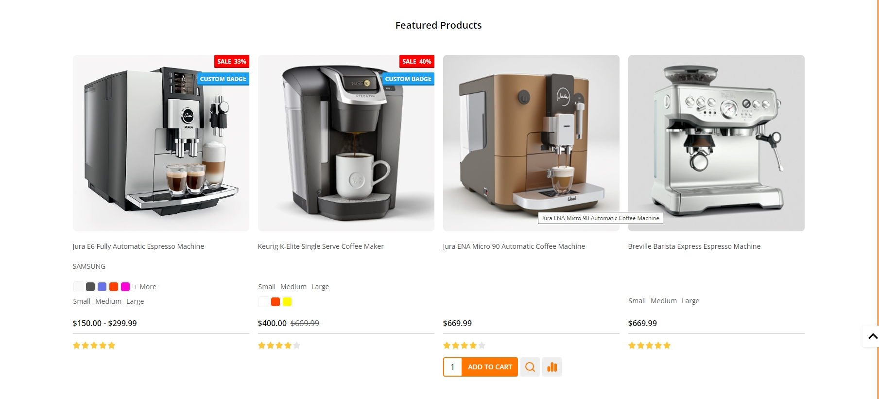
You can set featured products in Products, click the star icon on the same row to set the product as featured.
Go back to Page Builder > Theme Styles > Home Page, make sure one of the Sections has typed featured_products. In Featured products section, you can change the Heading, Number of products to display, Number of product per row (Columns), changing Display type to Carousel or Grid, changing the background color, editing the link of View all products.
Grid layout banners
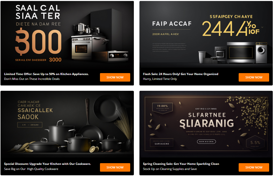
To create grid layout banners :
In Page Builder, drag & drop Layout widget to the corresponding position. Change Column = 1, set Padding = 0 0 0 0.
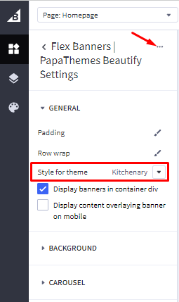
Drag and drop Flex Banners | PapaThemes Beautify widget into Column 1. Click on Setting > Style for theme select kitchenary Then delete all Flex Banners except the first one.
To edit Banner 1, change your image, set Image width = 1200px, Image height = 600px. If you want to display different image on mobile check on Show different image on mobile and upload your image and adjust image size.
In Content > set Content Align follow vertical = bottom, Content padding and Content padding (Tablet) = 15 20 15 20, Content padding (Mobile) = 15 15 15 15. Change Content background color to #000000 and hide Heading content.
In Content > activate the Description text, set Font weight = Normal, Text color = #FFFFFF
In Content > activate the Action button, set Position = Right.
In General > Width panel choose Width = %, set Value (Desktop) and Value (Tablet) = 50%, Value (Mobile) = 100%.
In General > Padding, set Desktop = 15 15 15 15, Tablet = 8 8 8 8 and Mobile = 8 0 8 0.
Duplicate to 4 banners and upload images according to each banner.
New Products
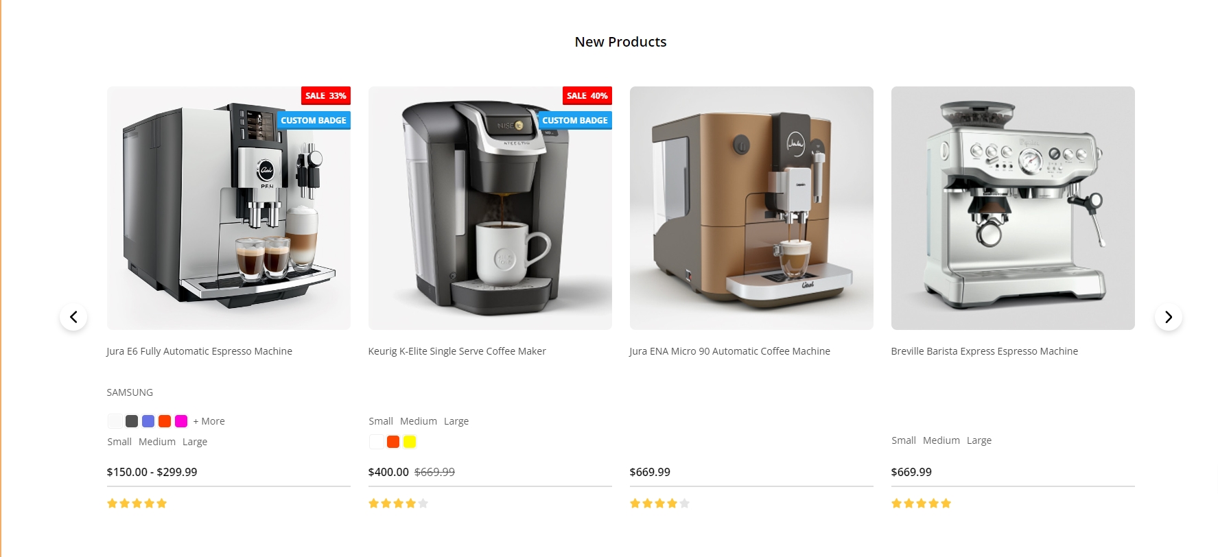
You can configure new products section settings in Page Builder > Theme Styles > Home Page, make sure one of the Sections has typed new_products . In New products section, you can change the Heading, Number of products to display, Number of product per row (Columns), changing Display type to Carousel or Grid, changing the background color, editing the link of View all products.
Bestselling Products
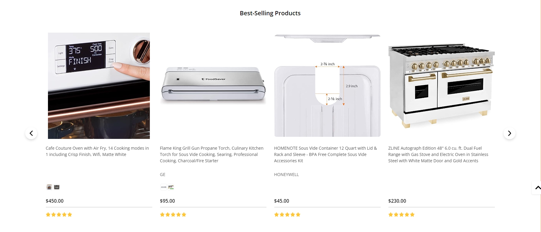
Bestselling products only display when your store has some order.
You can configure bestselling products section settings in Page Builder > Theme Styles > Home Page, make sure one of the Sections has typed popular_products. In Best-sellers products section, you can change the Heading, Number of products to display, Number of product per row (Columns), changing Display type to Carousel or Grid, changing the background color, editing the link of View all products.
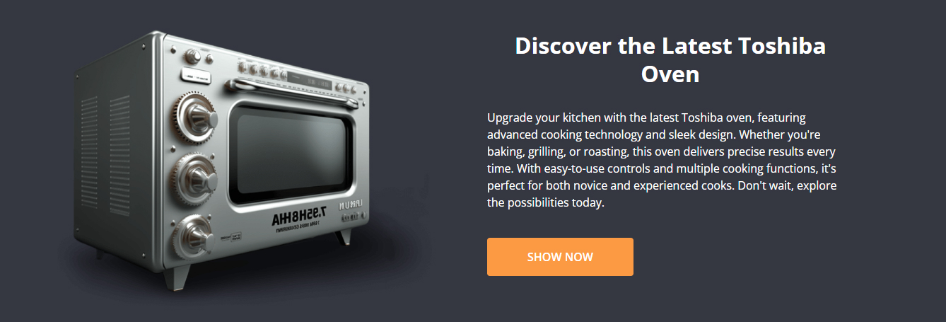
Banner
Desktop :
Mobile :
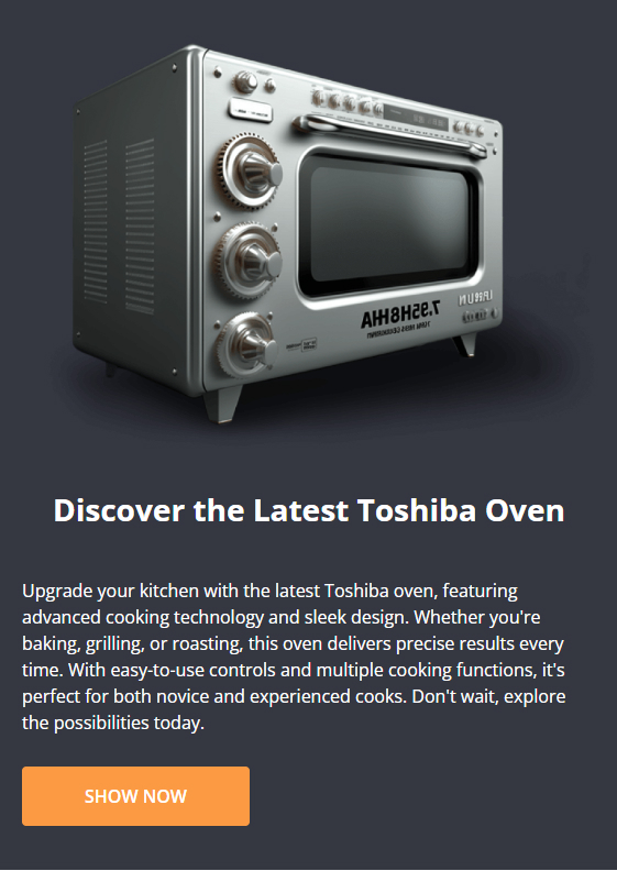
Drag & drop Layout widget to the corresponding position, change Column = 1, set Padding = 0 0 0 0.
Drag & drop Leaderboard Banner| PapaThemes Beautify, set Banner height = 800px and Banner height(mobile) = 369px. Consider the background color of you want Background color.
You can customize the desktop image in the Image section, and also modify the images for the tablet and mobile screens in the Image (mobile) section. Unchecked Display in container div
In Heading, set Heading Style = Custom, Font Weight = Bold, Font size = 32px, Heading color and Heading color(mobile) = #FFFFFF.
In Text, set Font Size = 16px, Font weight = Medium, Text color and Text color(mobile) = #FFFFFF.
In Button, set Button color = #FB9A43
In Advanced, choose style for theme = Kitchenary.
Categories Banner

Drag & drop Layout widget to the corresponding position, change Column = 1, set Padding = 0 0 0 0.
Drag & drop Flex banners|papathemes beautify to column 1 and delete all banner except the first one.
Insert your banner image with size 1092x135, change image width = 1092and image height = 135
Set border radius = 4px
in content, disable heading text
Recently Viewed Products
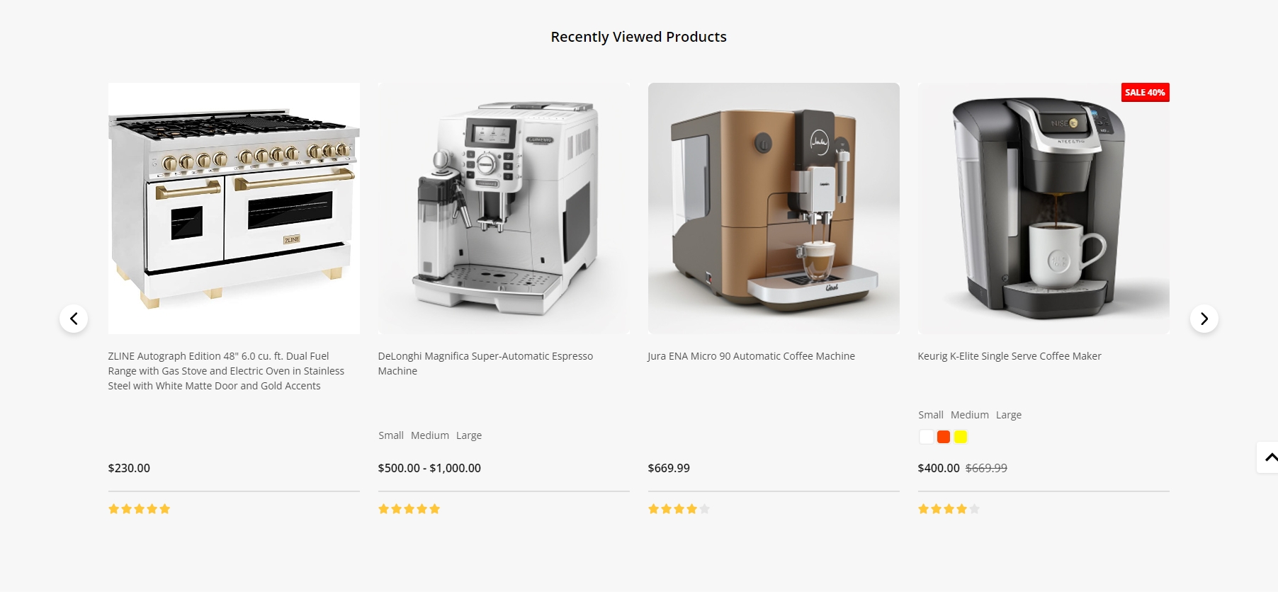
Recently Viewed Products will be display automatically viewed any product.
You can configure recently viewed products section settings in Page Builder > Theme Styles > Home Page, make sure one of the Sections has typed recentviewed. In Recently Viewed Products section, you can change the Heading, Number of products to display, Number of product per row (Columns), changing Display type to Carousel or Grid, changing the background color, editing the link of View all products.
Customer Service

To enable Customer service, in Theme Styles > Homepage > Section choose one of sections and type customer_service to enable this block.
To change color background of this section click on Background and select color fit to design.
This section allow user change section tiltle, in Hompage find Customer service type your text in Heading.
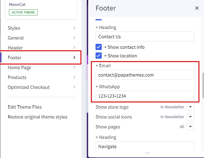
- Phone number: will automatically collect number from store profile.
- Whapsapp: To change Whatsapp number, go to Footer find +Whatsapp and type your number in the input field.
- Email: To change email number, go to Footer find +Email and type your email address in the input field.
To change Background of button, go to General find General colors change Secondary color to your color.
To change Text, Icon, color go to General find Links colors change Default to your color.
Recent Blog Posts
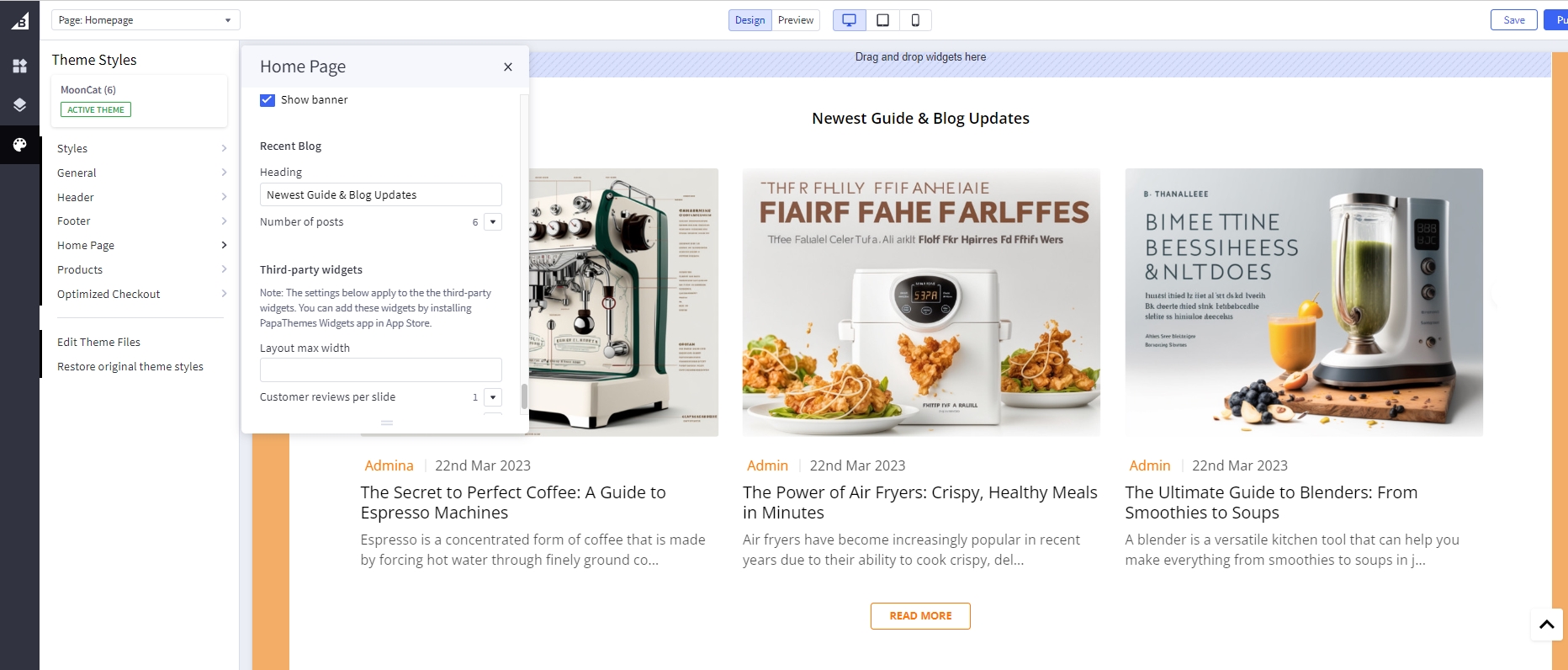
You can add blog posts in Storefront > Blog. Click the + button to add a new blog post. Make sure Blog Visibility is on.
To display the recent blog posts on the home page, go to Page Builder. In Theme Styles > Home Page, make sure one of Sections has typed blog_recent. Scroll down the Recent Blog section, you can configure Heading, Number of posts to display.
Customer Reviews
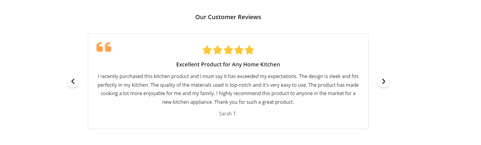
Drag & drop Layout widget to the corresponding position, change Column = 1. Select Column 1, set Padding = 0 0 0 0.
Drag & drop Section Heading | PapaThemes Beautify widget into the Layout. Typing your text (example "Our Customer Reviews"), select custom in Text style field, set Font size = 20px, Text color = #000000, Margin = 36 0 16 0, Margin (Mobile) = 18 0 0 0.
Drag & drop Customer Reviews | PapaThemes Beautify widget below Section Heading | PapaThemes Beautify widget. Make sure to remove all reviews except for the first one.
For each review, provide the following details:
Title: Enter the title of the review.
Content: Write the content of the review.
Rating: Choose the desired number of review stars.
Author: Specify the name of the reviewer.
To maintain consistency in the theme, select Beautify Furniture in the Style for theme option.
If you want to add more reviews, duplicate the first review as many times as needed and update the content for each review.
Newsletter
To enable newsletter form, go to Marketing > Email Marketing, make sure Allow Newsletter Subscriptions is checked. Optionally select Show Newsletter Summary and enter the summary text as you want.
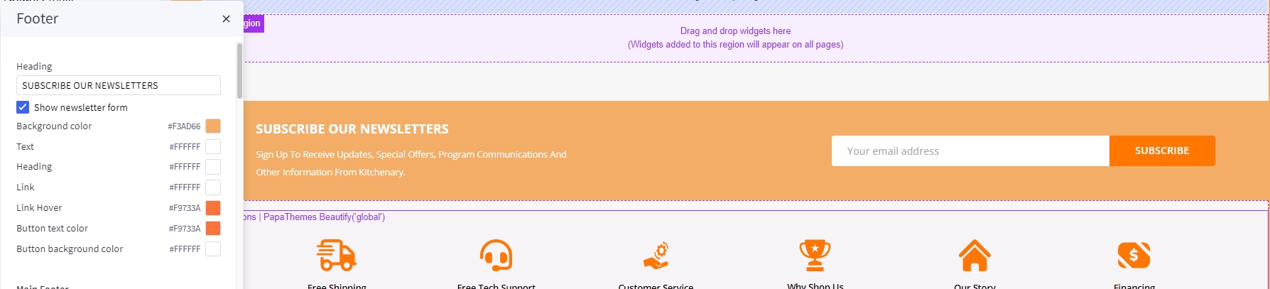
Go to Page Builder, in Theme Styles > Footer > Newsletter section.
Make sure Show newsletter form is selected. You can change the Heading, background color, background image, button and text colors.
Watch the instruction video:
Newsletter Popup
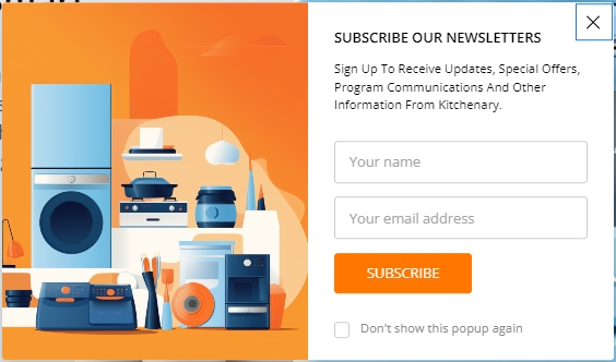
Newsletter Popupuse the same content and heading with Newsletter in footer. Please find instruction to change content in Newsletter.
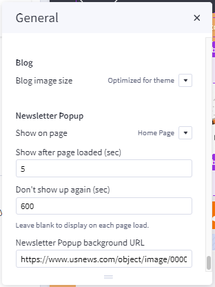
To change delay time and show up again peropd for display Newsletter Popup, in Theme styles > General > Newsletter Popup change Show after page loaded (sec) for delay time to display the popup, change Don't show up again (sec) for the popup re-appear again.
To change image in Newsletter popup, simply copy and paste your Image URL to Newsletter Popup background URL
Benefit
Desktop :
To create Benefit:
In Page Builder, drag & drop Layout widget to the corresponding position. Change Column = 1, set Padding = 0 0 0 0.
Drag and drop Callout Icons | PapaThemes Beautify widget into Column 1. Delete all other callouts except the first one.
Choose the Large option in the Icon section.
For the Width, select the unit % and specify the values for different devices as follows: Desktop = 16,5%, Tablet = 33,33%, Mobile = 50%.
In the Padding section, set the values for different devices as follows: Desktop = 45 5 45 5, Tablet and Mobile = 20 5 20 5.
Select your desired icon in the Icon section, then change icon color follow your design.
In Show text, Text style choose Custom then set text color = #000000 and text color (hover) = #FF7700.
Enable Show second text, Text style choose Custom then set text color = #000000 and text color (hover) = #FF7700
Duplicate Icon-1 to 6 icon. Change the image and link for each duplicated icon.
Footer
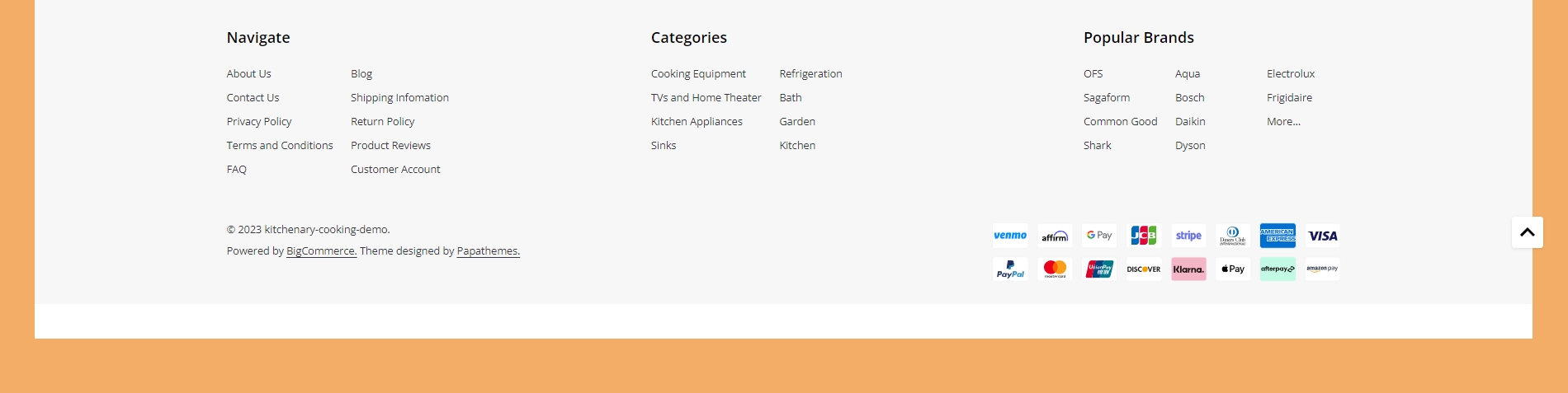
In Page Builder > Theme Styles > Footer, you can configure the newsletter form appearance in Newsletter section, configure the footer link colors in Main Footer section, displaying store logo, contact info, store address,... Show pages allows to limit number of web page links to display. Show categories allows to limit number of category links to display. Similarly for Show brands option.
Payment Icons allows to select which payment icons to display.
Copyright allows to configure the copyright text.
Watch the instruction video:
Footer Map
Create map using widget
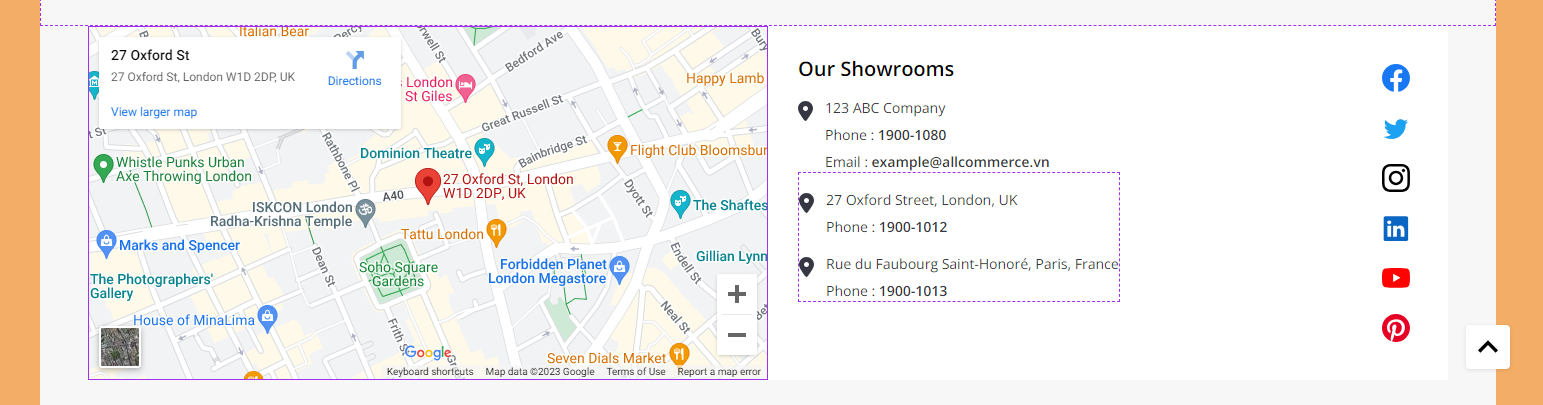
Drag and drop the Layout widget to the desired position. Set the Column = 1.
Select Column 1 and set the Padding = 0 0 0 0.
Drag and drop the HTML widget into the Layout section.
Obtain the embed map code by following these instructions:
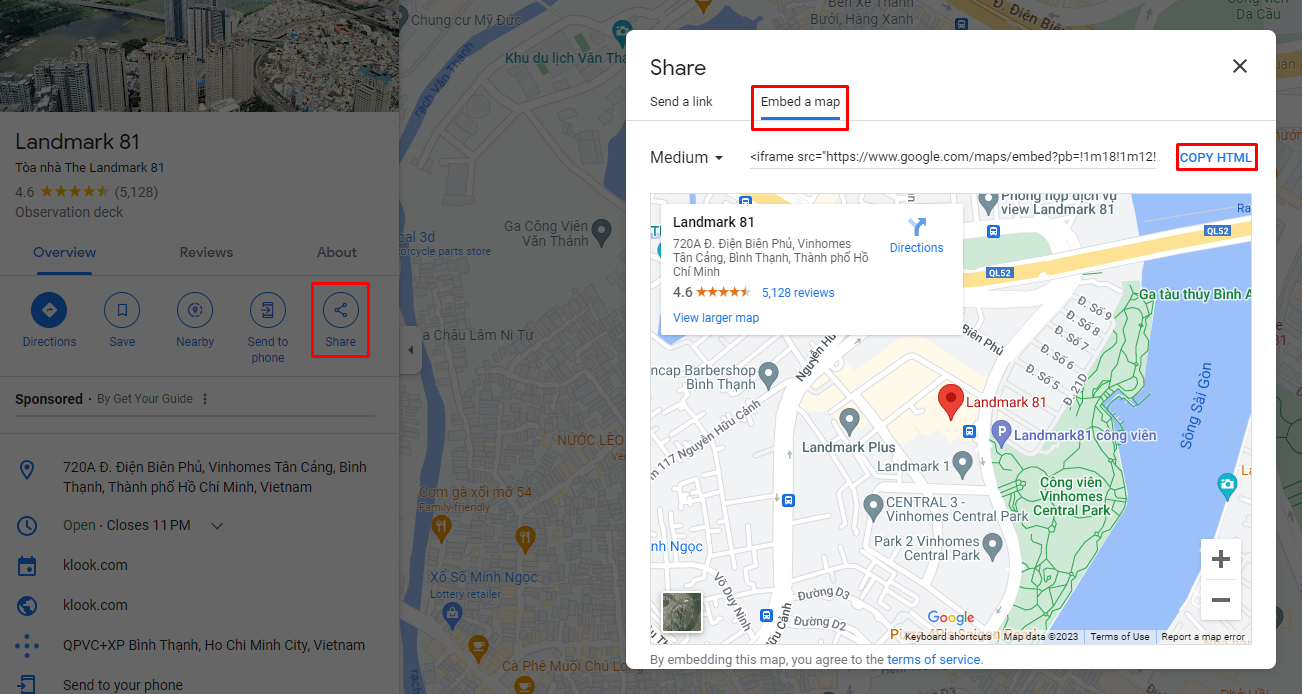
Go to https://www.google.com/maps and enter the desired location. On the left side of the screen, select Share and then choose Embed a map. Copy the HTML code provided.
Paste the map code into the HTML editor. Edit the width and height = 100%, and click the Save HTML button.

To display the map using an API key:
Configure Footer map in Page Builder > Theme Styles > Footer > Main Footer.
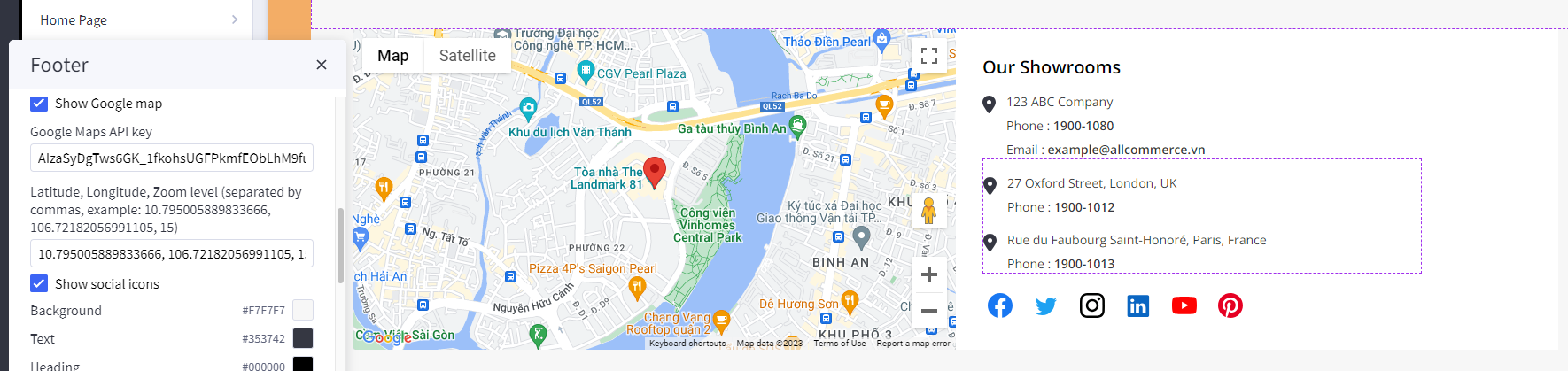
Enable the Show Google map option.
Fill in your Google Maps API key. If you don't have an API key, please see instruction at the link: https://developers.google.com/maps/documentation/javascript/get-api-key
Enter the Latitude, Longitude, and Zoom level for the map. Separate the values with commas and ensure they are contiguous.
Example: 10.795005889833666, 106.72182056991105, 15.
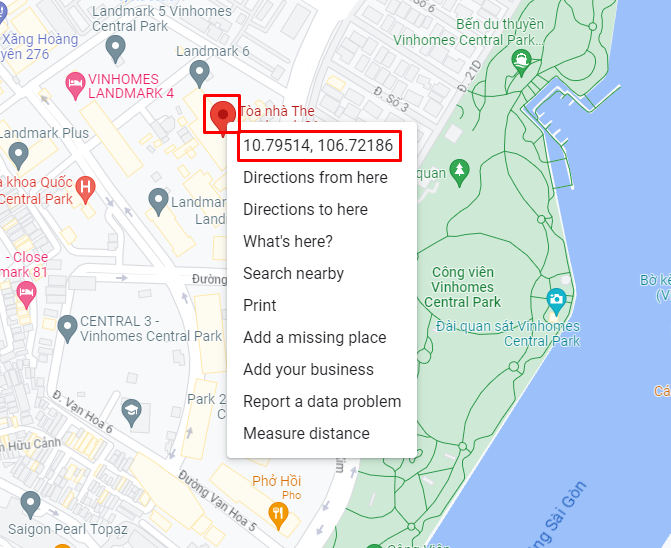
To obtain the latitude and longitude values, follow these steps:
Go to https://www.google.com/maps and enter the desired location.
Right-click on the marker icon on the map and copy the longitude and latitude values.
Instagram photos
To display your Instagram photos, open https://instagram.papathemes.com/ Follow the instruction on this page to Connect your Facebook Page with your Instagram account. Then click Login With Facebook button and follow the further steps to authorize access permission. Click Show Embedding Code button to generate the code embedding to your web store. Choose Preset = Carousel and select LazyLoad.
Copy all the code appear in Step 1 & Step 2. For example:
<script>!function(){var a=document.createElement("script");a.defer=!0,a.src="https://papathemes.s3.amazonaws.com/instagramapp/assets/js/embed-1.0.1.js",a.onload=function(){PapathemesInstagramApp.init({account_id:"****************",element_id:"papainstagram-render",limit:"20",preset:"grid",lazyload:"false"})},document.body.appendChild(a)}();</script>

<div id="papainstagram-render"></div>
Go back to your store Page Builder. Drag & drop the HTML widget to the corresponding position. Paste the generated code above to the HTML editor, and click Save HTML button. Your Instagram photos should display like our demo store.
Please note that the app only updates your latest uploaded photos every 6 hours.
To create the title, drag & drop the Section Heading widget to above the Instagram photos. Set Padding = 40 0 40 0 and Padding (Mobile) = 20 0 20 0.
Watch the instruction video:
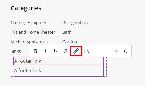
Display Custom Footer Links
In Page builder > Custom Widget find Footer links | PapaThemes Beautify widget then drag and drop the widget to corresponding position in Footer.
Select the Column 1 and change padding to 0 0 0 0.
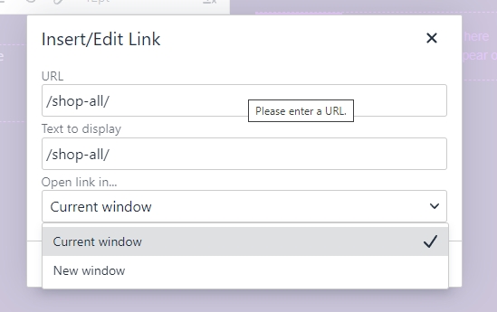
In design you can type your link content and click on the insert/edit link button as picture below:
In the popup window, copy your web link to URL. On the Open links.. field you can select how your link could be open in New Window or Current Window
Setting Up Pharmacy Style Home Page
General
You can read these common instructions in Setting Up Cooking Style Home Page chapter:
- Header
- Top Banner
- Ad Banner displays on all pages
- Main carousel
- Shopping Guide
- Top Categories
- Featured brands
- Bestselling products
- Banner
- Featured products
- New products
- Recently viewed products
- Customer service
- Recent blog posts
- Customer reviews
- Newsletter
- Footer
- Footer Map
- Display custom footer links
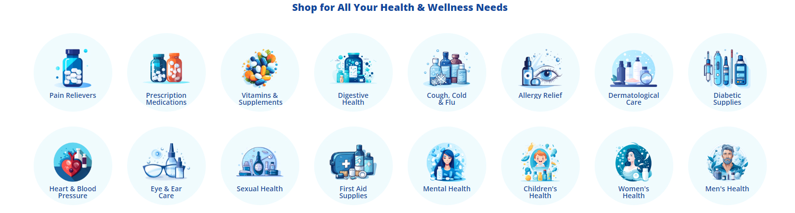
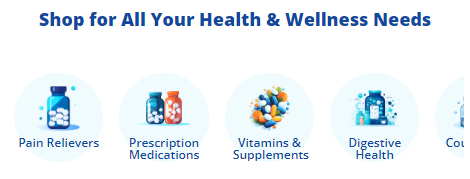
Shop for All Your Health & Wellness Needs
Desktop :
Mobile :
Drag & drop Layout widget to the corresponding position, change Column = 1, set Padding = 0 0 0 0.
Drag & drop Section Heading | PapaThemes Beautify widget into the Layout. Typing your text (example "Shop for All Your Health & Wellness Needs"), select custom in Text style field, set Font size = 20px, Font size(Mobile) = 18px, Font weight = Extra Bold, Text color = #0F49A0, Padding = 10 0 40 0 and Padding (Mobile) = 18 0 18 0.
Drag & drop Callout Icons | PapaThemes Beautify widget below Section Heading | PapaThemes Beautify widget. Delete all other callouts except the first one.
Choose the Circle option in the Icon section.
For the Width, select the unit % and specify the values for different devices as follows: Desktop = 12.5%, Tablet = 15.5% and Mobile = 23%.
In the Padding section, set the values for different devices as follows: Desktop = 0 15 30 15, Tablet and Mobile = 0 8 0 8.
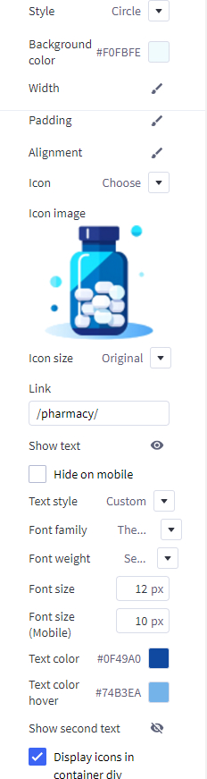
Select Icon = Choose Image, change the image to suit your needs in the Icon Image. Paste the link into the designated Link box.
Select Custom for the Text style. Set the Font size = 12px for desktop devices. Adjust the Font size(Mobile) = 10px. Customize the text content and choose your preferred Text color.
Duplicate Icon-1 to create more similar icons. Change the image and link of the icons just created.
Four Banner
Desktop :
To create Four Banner :
In Page Builder, drag & drop Layout widget to the corresponding position. Change Column = 1, set Padding = 0 0 0 0.
Drag and drop Flex Banners | PapaThemes Beautify widget into Column 1.
To edit Banner 1, change your image, set Image width = 1800, Image height = 900, Border radius = 0px.
In Content > Content padding = 15 20 15 20 for all values, you can choose the custom background color for the Content background as per your preference.
In Content > Heading text, set Text style = Custom, font weight = Light, font size = 16px and font size(mobile) = 14px, Text color and Text color hover = #0F49A0.
In Content > activate the Action button, set Position = Right.
In General, choose Width = %, set Value (Desktop) and Value (Tablet) = 50%, Value (Mobile) = 100%. Set Padding for Desktop and Tablet =0 15 30 15, Mobile = 0 0 15 0.
In Settings > General, set Style for theme = Kitchenary, unchecked Display content overlaying banner on mobile.
Duplicate Banner 1 to 4 banners.
Three Banners
Desktop :
To create Three Banners :
In Page Builder, drag & drop Layout widget to the corresponding position. Change Column = 1, set Padding = 0 0 0 0.
Drag and drop Flex Banners | PapaThemes Beautify widget.
To edit Banner 1, change your image, set Image width = 1170, Image height = 781, Border radius = 4px.
In Content > Content Padding set 15 0 0 0 for all values.
In Content > Heading text, set Text style = Custom, font weight = Bold, font size and font size(mobile) = 16px, Text color = #0F49A0.
In Content > activate the Description text, set Font weight = Light, Font size and Font size (Mobile) = 16px, Text color and Text color (Mobile) = #000000, Text color hover and Text color hover (Mobile) = #0F49A0.
In General, choose Width = %, set Value (Desktop) and Value (Tablet) = 33,33333%, Value (Mobile) = 100%. Set Padding for Desktop and Tablet =0 15 0 15, Mobile = 0 0 30 0.
In Settings > General, set Style for theme = Kansha Sport, unchecked Display content overlaying banner on mobile.
Duplicate Banner 1 to 3 banners.
Setting Up Fashion Style Home Page
General
You can read these common instructions in Setting Up Cooking Style Home Page and Setting Up Pharmacy Style Home Page chapter:
- Header
- Top Banner
- Ad Banner displays on all pages
- Main carousel
- Shopping Guide
- Top Categories
- Featured brands
- Banner
- Bestselling products
- Four Banner
- Featured products
- New products
- Three Banners
- Recently viewed products
- Customer service
- Recent blog posts
- Customer reviews
- Newsletter
- Footer
- Footer Map
- Display custom footer links
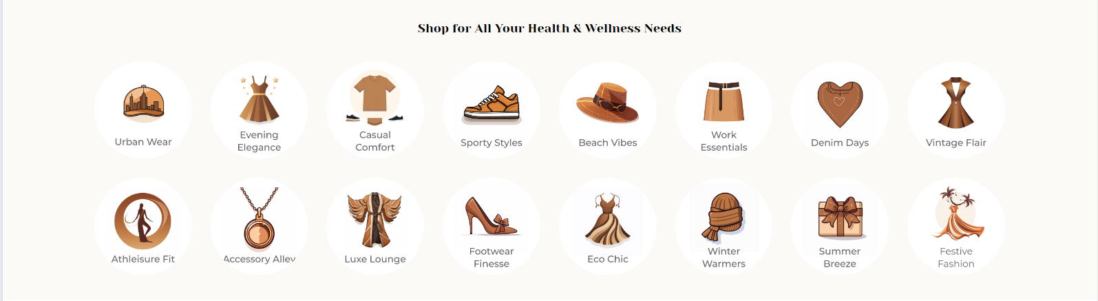
Shop for All Your Health & Wellness Needs
Desktop :
Mobile :
Drag & drop Layout widget to the corresponding position, change Column = 1, set Padding = 0 0 0 0.
Drag & drop Section Heading | PapaThemes Beautify widget into the Layout. Typing your text (example "Shop for All Your Health & Wellness Needs"), Padding = 40 0 25 0 and Padding (Mobile) = 30 0 20 0.
Drag & drop Flex Banners | PapaThemes Beautify widget below Section Heading | PapaThemes Beautify widget. Delete all other callouts except the first one.
To edit Banner 1, change your image, set Image width = 250px, Image height = 250px. Image alt text refers to modifying the caption of an image according to your preferences. Border radius = 8px
For the Width, select the unit % and specify the values for different devices as follows: Desktop = 12.5%, Tablet = 25% and Mobile = 30%.
In the Padding section, set the values for different devices as follows: Desktop = 15 15 15 15, Tablet and Mobile = 8 8 8 8.
In Settings > General :
Choose Padding, set value Desktop = 0 0 25 0 and Tablet and Mobile = 0 0 15 0 , checked Display content overlaying banner on mobile.
Choose Row wrap, checked Row no wrap on table and Row no wrap on mobile.
Duplicate Banner 1 to create more similar icons. Change the image and link of the icons just created.
Select Icon = Choose Image, change the image to suit your needs in the Icon Image. Paste the link into the designated Link box.
Select Custom for the Text style. Set the Font size = 12px for desktop devices. Adjust the Font size(Mobile) = 10px. Customize the text content and choose your preferred Text color.
Duplicate Icon-1 to create more similar icons. Change the image and link of the icons just created.
Setting Up Game Style Home Page
General
You can read these common instructions in Setting Up Cooking Style Home Page, Setting Up Pharmacy Style Home Page and Setting Up Fashion Style Home Page chapter:
- Header
- Top Banner
- Ad Banner displays on all pages
- Main carousel
- Shopping Guide
- Top Categories
- Featured brands
- Banner
- Bestselling products
- Featured products
- New products
- Three Banners
- Recently viewed products
- Customer service
- Customer reviews
- Newsletter
- Footer
- Footer Map
- Display custom footer links
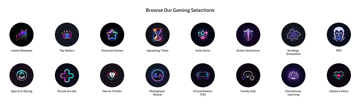
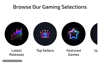
Browse Our Gaming Selections
Desktop :
Mobile :
Drag & drop Layout widget to the corresponding position, change Column = 1, set Padding = 0 0 0 0.
Drag & drop Section Heading | PapaThemes Beautify widget into the Layout. Typing your text (example "Browse Our Gaming Selections"), Padding = 40 0 30 0 and Padding (Mobile) = 16 0 18 0.
Drag & drop Flex Banners | PapaThemes Beautify widget below Section Heading | PapaThemes Beautify widget. Delete all other callouts except the first one.
To edit Banner 1, change your image, set Image width = 100px, Image height = 100px. Image alt text refers to modifying the caption of an image according to your preferences. Border radius = 50px.
In Content > set Content Align = Center follow vertical = Bottom.
In Content > Heading text set Text style = Custom, Font Weight = Semi Bold, Font size and Font size(Mobile) = 12px, Text color and Text color (Mobile) = #000000, Text color hover and Text color hover (Mobile) = #F2186B
For the Width, select the unit % and specify the values for different devices as follows: Desktop = 12.5%, Tablet = 20% and Mobile = 30%.
In the Padding section, set the values for different devices as follows: Desktop = 10 15 10 15, Tablet and Mobile = 0 8 0 8.
In Settings > General :
Choose Row wrap, checked Row no wrap on table and Row no wrap on mobile.
Duplicate Banner 1 to create more similar icons. Change the image and link of the icons just created.
Special game information display
Setup game version in product detail
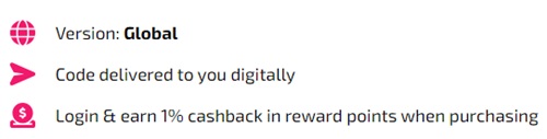
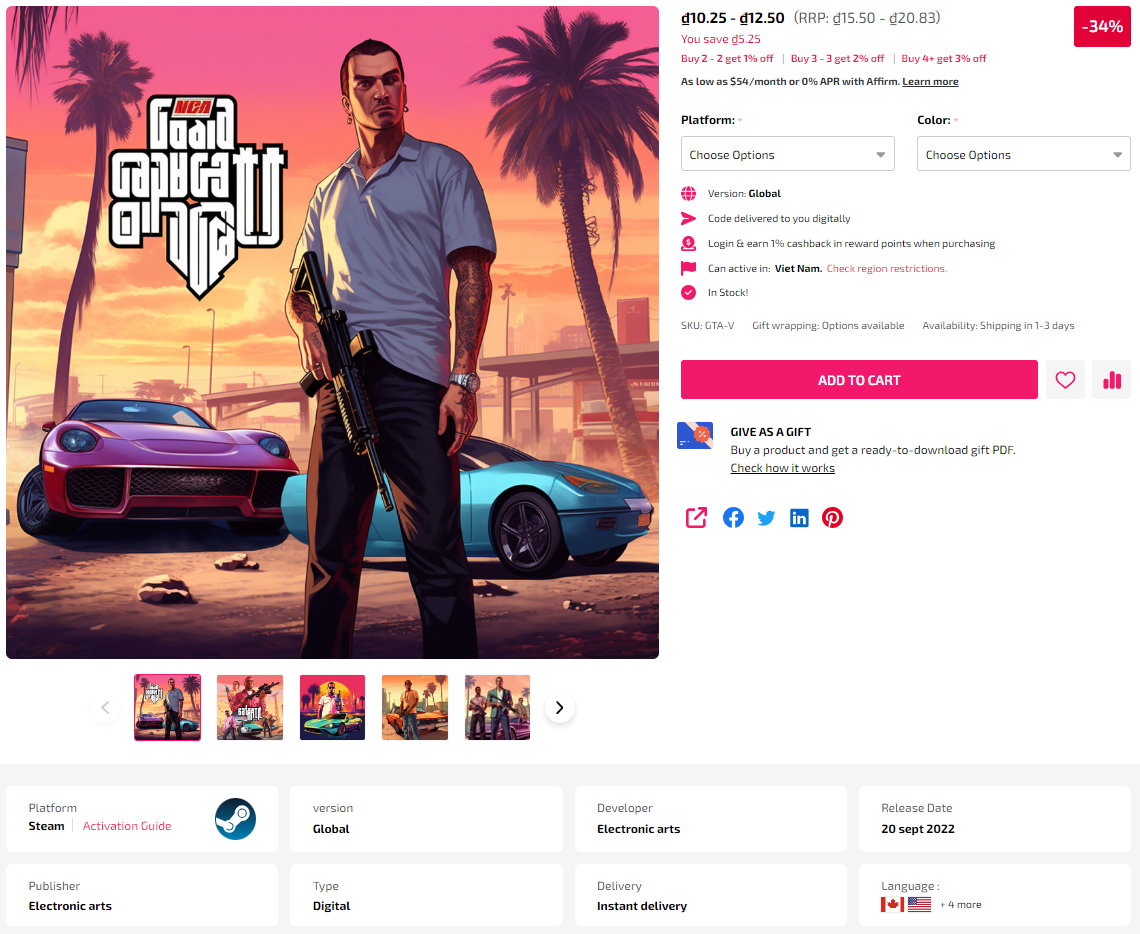
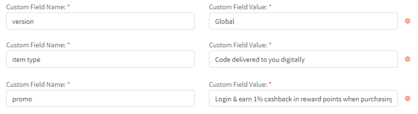
To add custom fields, go to the Product Editor. Find Custom Fields, created new custom field. These special custom fields need to be name correctly to be displayed.
The custom fields with specified Custom Fields Name are:
version
item type
promo
For example:
Setup Region/Popup restriction
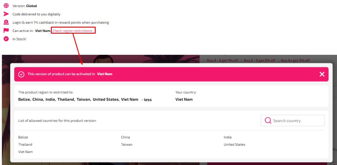
The Custom Fields Name region, the Custom Fields Value should be in the format of Country Codes, written as (Country Codes|Country Codes...).
For example: (VN|US|BZ|CN).
You can create more than one region custom field and add additional Country Codes values.
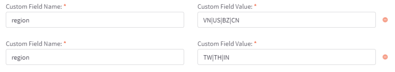
Note: you only need two or more custom fields region when the first custom field value have reach word limit.
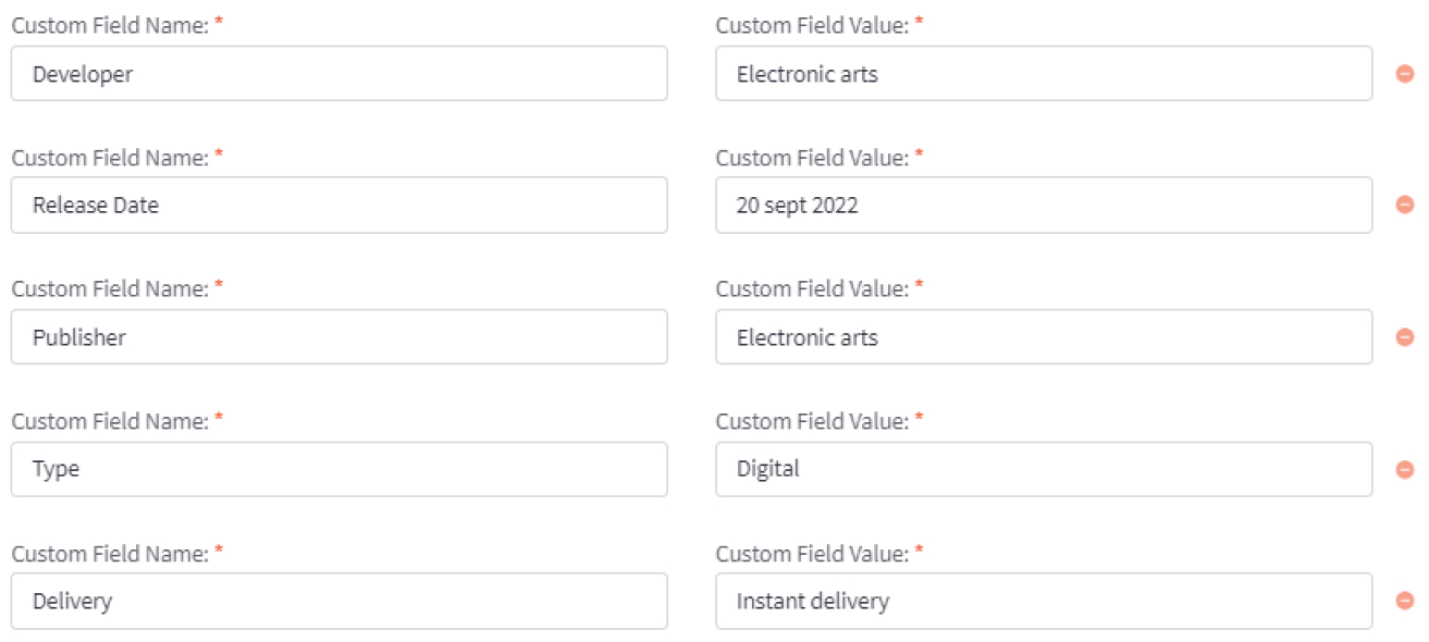
Setup product summary
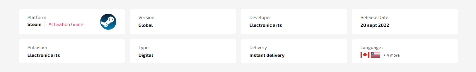
To add custom fields, go to the Product Editor. Find Custom Fields, created new custom field. These special custom fields need to be name correctly to be displayed.
The custom fields with specified Custom Fields Name are:
Developer
Release Date
Publisher
Type
Delivery
For example:
Setup - Platform

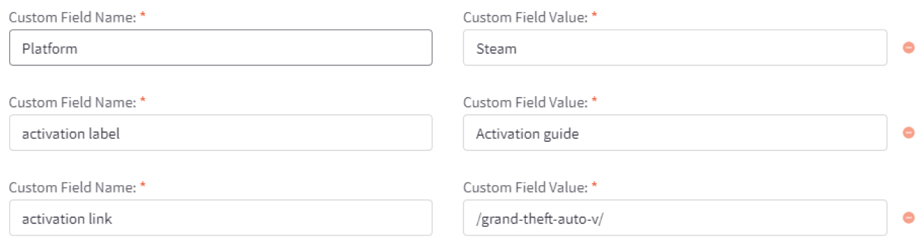
For the Platform section, it is constructed from 3 Custom Fields Name: platform, activation label, activation link.
The platform corresponds to the name of the games platform. The Logo of the platform will display correctly when you set Custom Fields Value according to the configuration names specified below:
battle.net
ea
epic games
gog.com
green gift
nintendo
origin
pc
play station
rock star
steam
ubisoft connect
windows
xbox-live
other
The activation label in the illustration above is Activation Guide, and the activation link is the browser path when clicked on the activation label.
For example:
Setup - Language
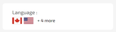
The Custom Fields Name 'language', the Custom Fields Value should be in the format of Country Codes, written as (Country Codes|Country Codes...).
For example: (US|KR|BR).
You can create more than one = language custom field and add additional Country Codes values.
Note: you only need two or more custom fields language when the first custom field value have reach word limit.
Customizing Products Display
Product Card
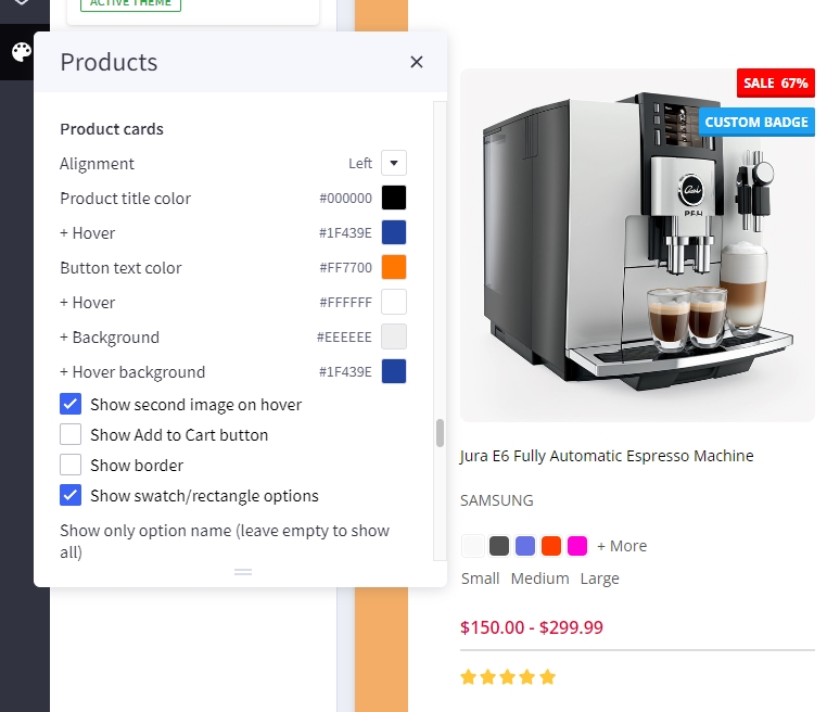
Configuring product cards in Page Builder > Theme Styles > Products > Product cards.
- Alignment: Specifying content alignment
leftorcenter. - Product title color: Specifying the product name's color.
-
- Hover: Specifying color when hover or focus.
- Button text color: Specifying the button text color.
-
- Background: Specifying the button background color.
-
- Border: Specifying the button border color.
- Show second image on hover: Displaying the second image when hover the product card.
- Show border: toggle displaying the product card border.
- Show swatch/rectangle options: Allows to display with swatch/rectangle type product option on every product card. It's helpful to display different product variants like colors or sizes.
- Swatch sizes: Specifying the swatch color/image size.
- Badge position: also to configure the sale badge position to
Top LeftorBelow image.
Displaying product price ranges
By default product price ranges is enabled. To turn off, Go to Page Builder > Theme Styles > Products > uncheck Price ranges checkbox.
Show retail price: Toggle displaying the product retail prices.
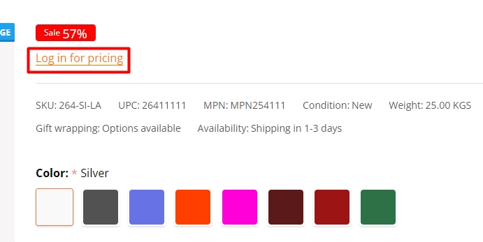
Hiding prices for non logged in customers
To turn on this feature, go to Page Builder > Theme Styles > Products > tick Restrict Purchase to Login checkbox.
Redirecting to cart page after product added to cart
By default the cart popup is displayed, if you want to take customer to the cart page instead, go to Page Builder > Theme Styles > Products > tick Redirect to cart page after add to cart checkbox.
Showing/Hiding Quick-View button
By default quick-view buttons appear on all product cards. To hide it, go to Page Builder > Theme Styles > Products > un-tick Show Quickview checkbox.
Showing/Hiding the quantity box on PDP
By default the quantity box shows up, to hide it, go to Page Builder > Theme Styles > Products > un-tick Show quantity selection on product pages checkbox.
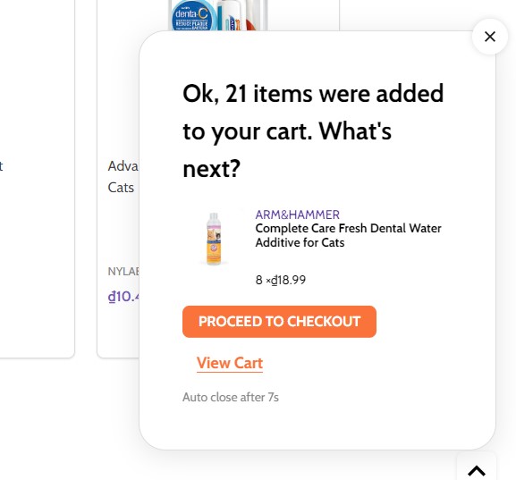
Customizing the popup displayed after product added to cart
In Page Builder > Theme Styles > Products > Popup after added to cart:
Default: Displaying the large popup.Mini: Displaying a smaller popup that has auto close.Cart Preview: Displaying the whole shopping cart popup on the right side.Hide: Not show any popup.
Mini added to cart popup:
Displaying Recently Viewed Products
Recently viewed products only display for logged-in customers.
To enable it, go to Page Builder > Theme Styles > Products > Show recently viewed select number of products to display.
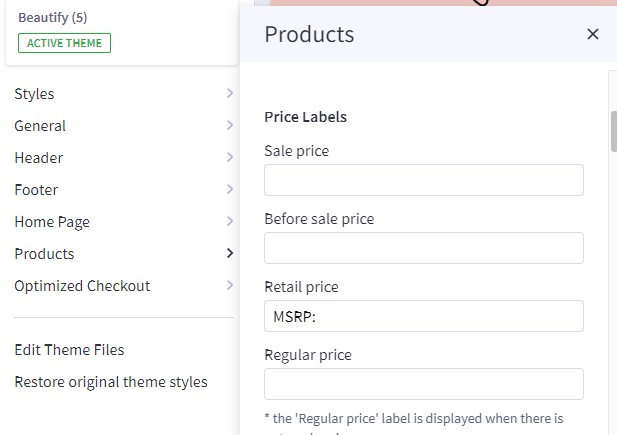
Customizing Price Labels
You can customize sale price label, before sale price label, retail price label or regular price label in Page Builder > Theme Styles > Products > Price Labels
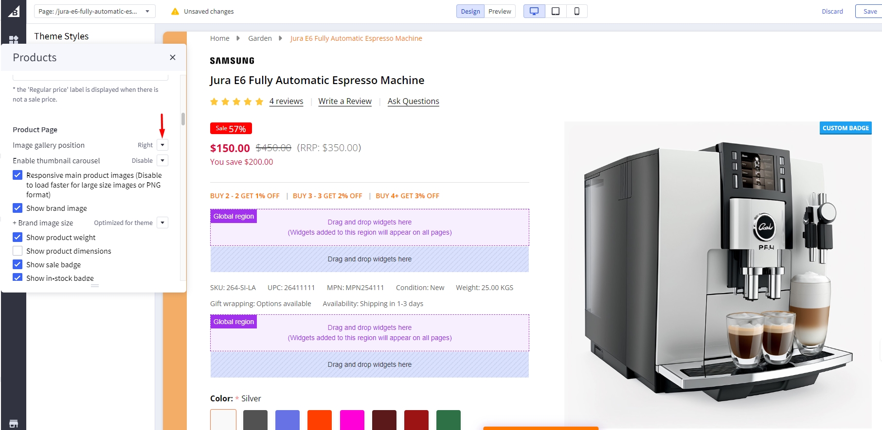
Displaying product weight, dimensions on PDP
Go to Page Builder > Theme Styles > Products > Product Page.
- Tick Show product weight checkbox.
- Tick Show product dimensions checkbox.
Display sale badge / in-stock badge on PDP
Go to Page Builder > Theme Styles > Products > Product Page.
- Tick Show sale badge checkbox.
- Tick Show in-stock badge checkbox.
Displaying Image gallery
Image Gallery Position
In Page Builder > Theme Styles > Products > Product Page, In Image gallery position , select Left or Right to change Image gallery position .
Right
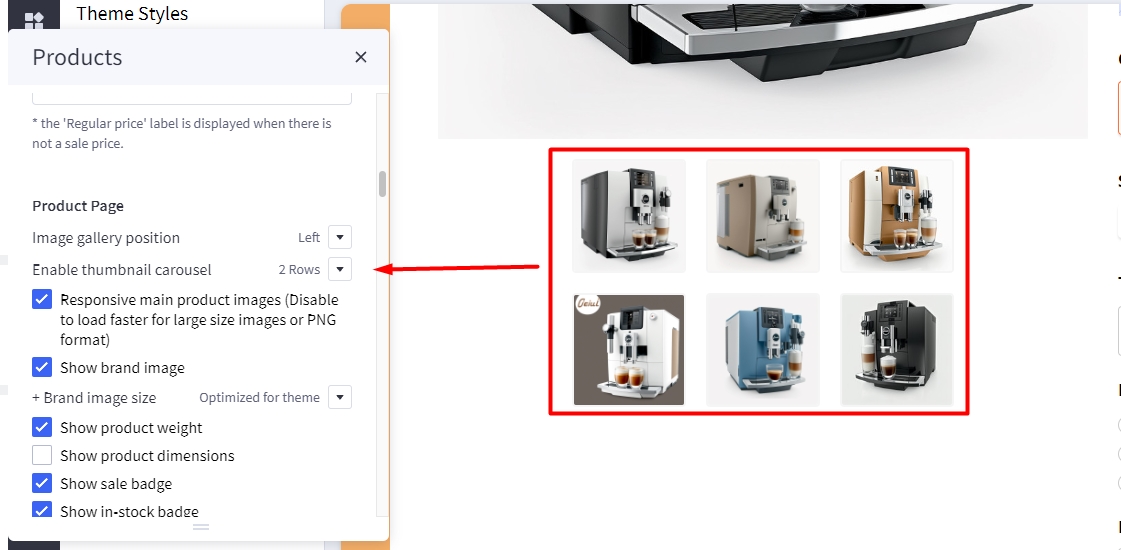
Displaying sub-image as a slider
In Page Builder > Theme Styles > Products > Product Page, Enable thumbnail carousel section, you can change display thumbnail images to slider or grid.
-
1 row: Sub-images are displayed in the slider on 1 row. -
2 rows: Sub-images are displayed in the slider on 2 row. -
Hide: All sub-images are displayed as grid.
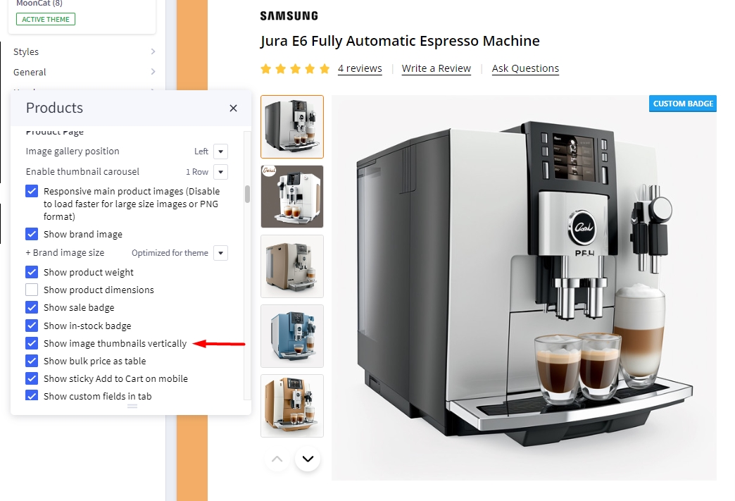
Displaying product image thumbnails vertically
In Page Builder > Theme Styles > Products > Product Page, checked Show image thumbnails vertically to display product thumbnails vertically, otherwise it's displayed horizontally.
Checked Show image thumbnails vertically:
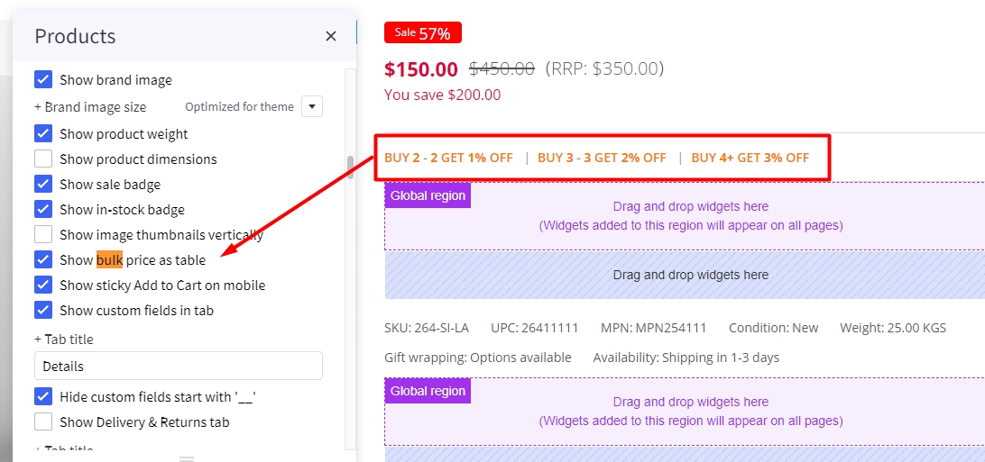
Displaying product bulk pricing inline in table
Instead of displaying bulk pricing in a popup modal, you can display it inline by going to Page Builder > Theme Styles > Products > Product Page, tick Show bulk price as table.
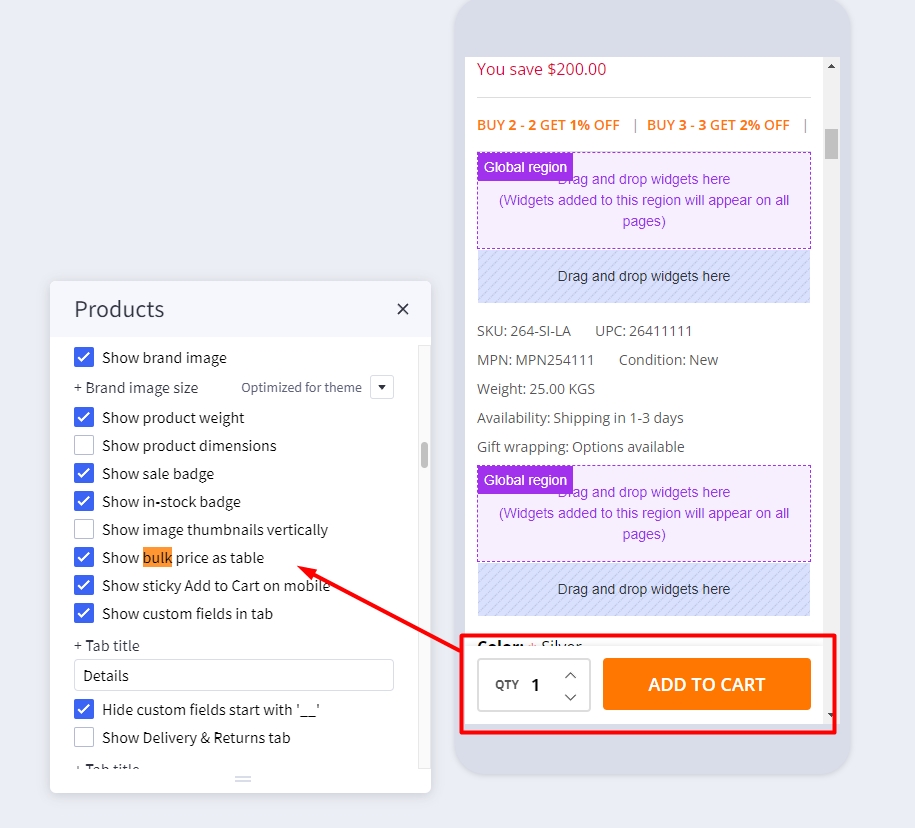
Displaying sticky Add to Cart button on PDP on mobile
In Page Builder > Theme Styles > Products > Product Page, tick Show sticky Add to Cart on mobile.
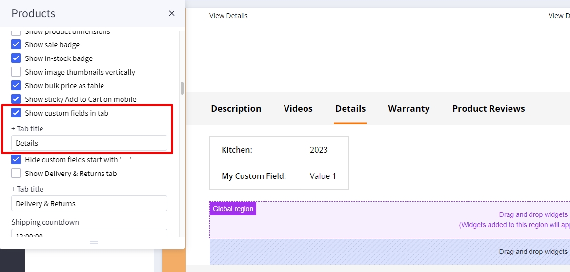
Displaying product custom fields in a separated tab
In Page Builder > Theme Styles > Products > Product Page:
- Tick Show custom fields in tab checkbox.
- Enter the tab title in the next Tab title box.
Custom tabs
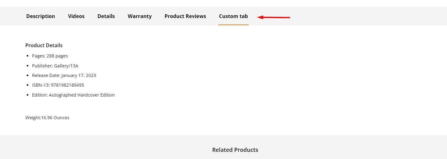 To add the custom tabs in product pages, edit your product description, click on HTML button to open HTML Source Editor:
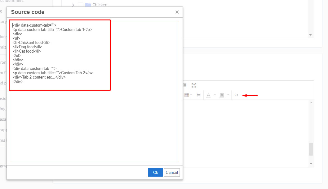
Use the editor at the link to generate HTML for your custom tabs. Click Export HTML button, copy & paste the generated HTML at the end of HTML Source Editor.
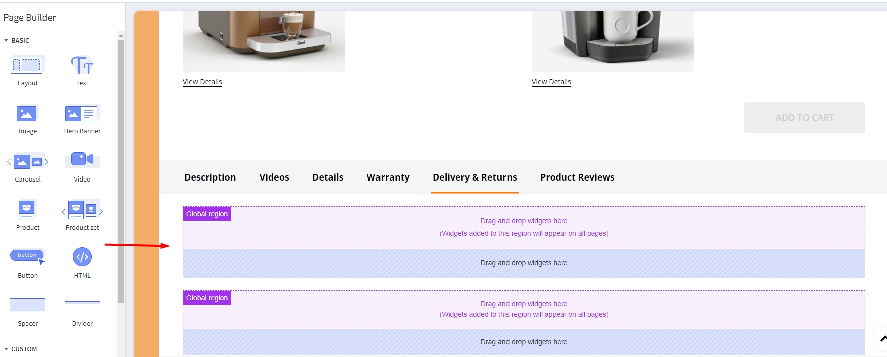
Displaying Delivery & Returns tab
In Page Builder > Theme Styles > Products > Product Page:
- Tick Show Delivery & Returns tab checkbox.
- Enter the tab title in the next Tab title box.
You can add specific content or global content using BC widgets:
Numbers of products, reviews, thumbnails
In Page Builder > Theme Styles > Products > Product Page:
- Number of Product Reviews: Specifying number of product reviews displayed.
- Number of Related Products: Specifying number of related products displayed.
- Number of Customers Also Viewed Products: Specifying number of customer also viewed products displayed.
- Number of visible thumbnails: Specifying number of images displayed in the product thumbnails slider.
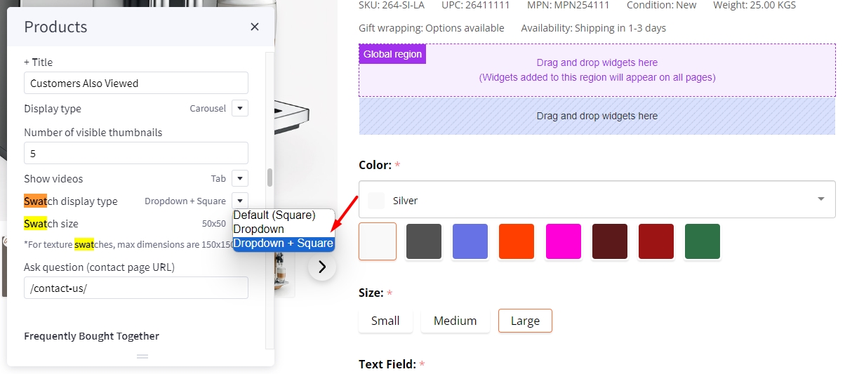
Displaying Swatch Options in the dropdown select box
In Page Builder > Theme Styles > Products > Swatch display type:
Default(Square): Displaying the regular swatches by default.Dropdown: Displaying swatches in the dropdown select box.Dropdown + Square: Displaying swatches in the dropdown select box in addition to regular swatches.
Displaying Frequently Bought Together Products
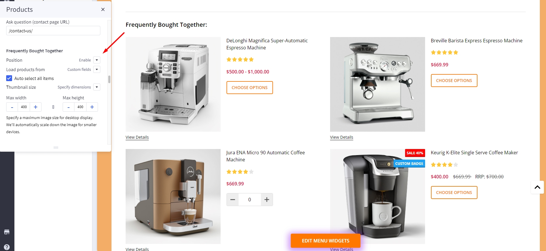
Enabling this feature in Page Builder > Theme Styles > Products > Frequently Bought Together, Select Position to display it.
- Load products from: Specifing products to display here.
Custom fields __alsobought: Specifying the relevant products in product custom fields with name__alsoboughtand value is the relevant product ID. For example: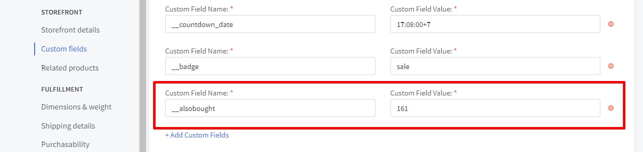
Related products: Pulling from the related products.Similar by biews: Pulling from customer also viewed products.- Auto select all items: Auto select or unselect all frequently bought together products.
- Thumbnail size: Specifying the thumbnail image size.
Configuring swatch dimension
In Page Builder > Theme Styles > Products > Swatch display type > Set Swatch size.
Sale badge, Condition badge and custom text badges
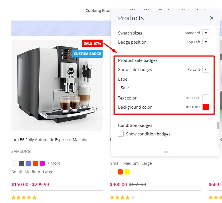
Displaying the sale badge in Page Builder > Theme Styles > Products > Product sale badges, tick Show sale badges.
- Label: Specifying the badge text.
- Text color: Specifying the badge text color.
- Background color: Specifying the badge background color
Displaying the condition badge in Condition badges, tick Show condition badges.
Displaying the condition badge in Custom badges, tick Enable custom badge from '__badge' custom field. Edit product, add custom field with name __badge and value is the badge text.
- Text color: Specifying the text color of the custom badge.
- Background color: Specifying the background color of the custom badge.
Configuring image sizes
In Page Builder > Theme Styles > Products > Image Sizes:
- Main product images: Specifying the main product image size displayed on PDP.
- Thumbnail image: Specifying the product thumbnail size.
- Zoomed image: Specifying the zoomed image size.
- Image in gallery view: Specifying product card image size.
Shipping countdown
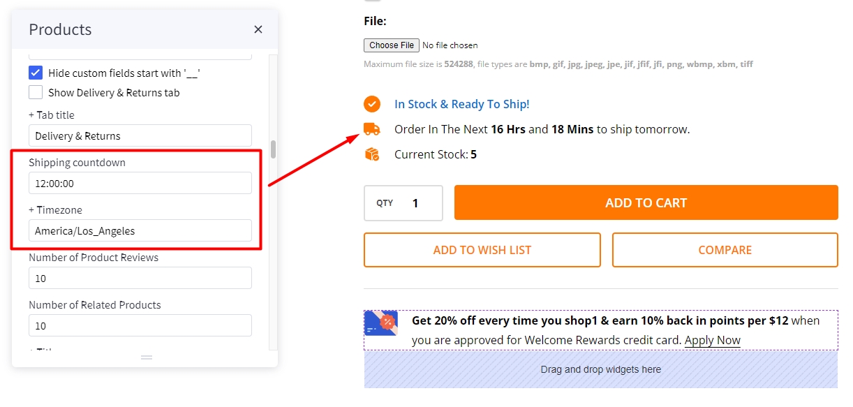
To enable shipping countdown, Theme styles > Product page find shipping countdown field and input your cut off time. Find and copied your timezone from wikipedia https://en.wikipedia.org/wiki/List_of_tz_database_time_zones to timezone field.
Note: The time before cut off the message will show shipping today after cut off the message will show shipping tomorrow
Flash sales
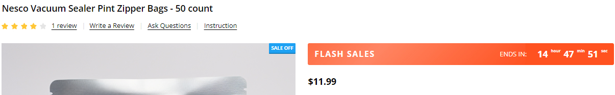
To create flash sales bar for each product, in product select the product that you want to add flash sale bar.
Find customer fields, click on add Add Custom Field. Copy __countdown_label and paste into Custom Field Name. In Custom Field Value, type your content following format: <your banner name>|<end in> (example: FLASH SALES|ENDS IN).
Create another custom field, Copy __countdown_date and paste into Custom Field Name. In Custom Field Value, enter your cut off time following the format: <yyyy>-<mm>-<dd> <hh>:<mm>:<ss><timezone> (example: 2023-03-15 17:00:00-7).
Note:
-
<yyyy>-<mm>-<dd>is optional. If the date is not entered, the banner will repeat automatically right after pass cut off time. -
<hh>:<mm>:<ss>is 24 hour format. -
<timezone>only input+ or -andnumberexample:+7. if timezone are not entered, the countdown time will be different in different countries.
Brand logo in product detail
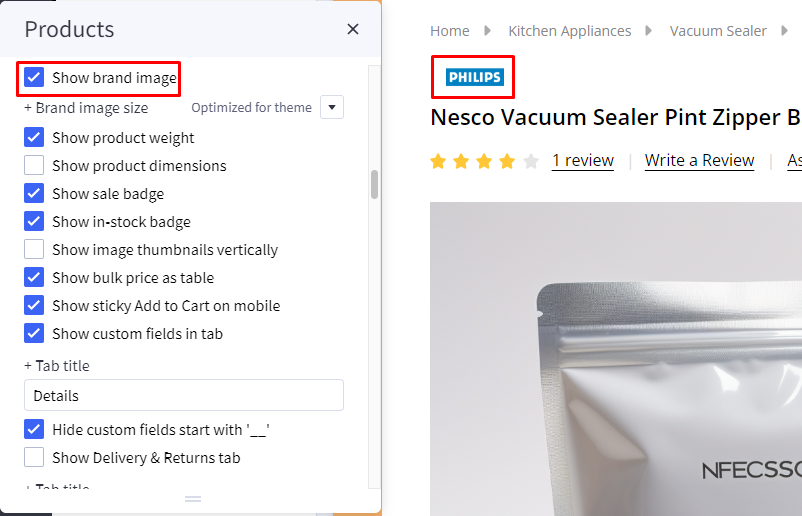
To display Brand logo in product detail, in Page Builder > Products > Product Page find and check Show brand image option.
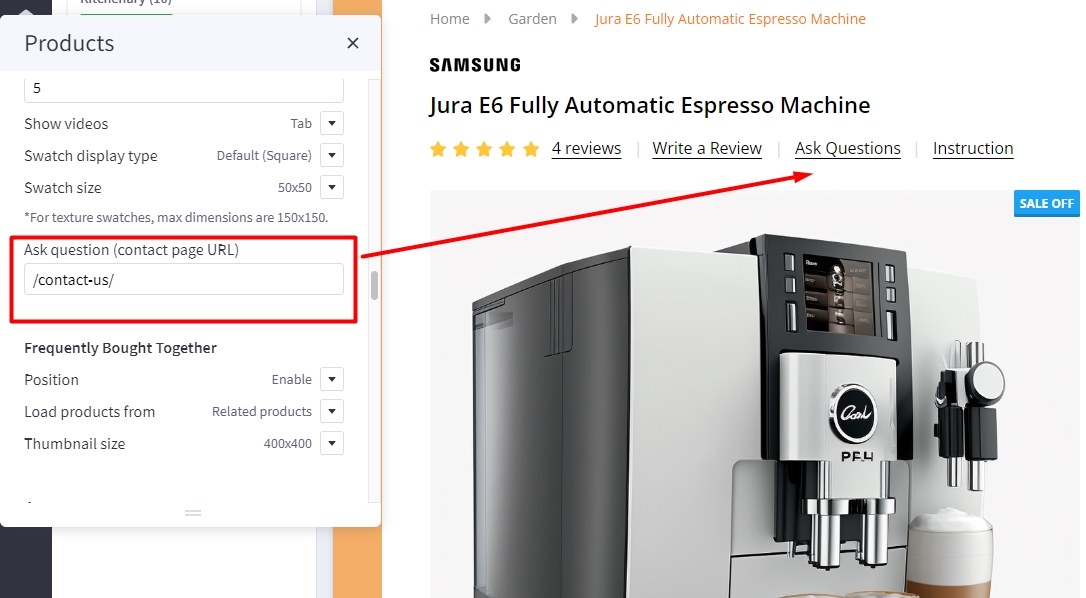
Ask question
In Page Builder > Theme Styles > Products > Product Page find Ask question (contact page URL) and enter /contact-us/ to display Ask Questions?.
Instruction & size guide
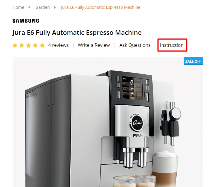
To create additional information link:
In Storefront > Web Pages, click on the Create a Web Page button to create new webpage.
In Web Page Details, enter your page name in Page Name field, Page URL will be automatically generated. In Page content field enter your content.
Uncheck Navigation Menu options.
In Advanced Options set Sort Order = 2.
To display the additional information link in the product detail page:
In Products, select the product you want to display the link. Find Custom Fields, created new custom field. Set Custom Fields Name = __guide_popup and Custom Fields Value = <your page name>|<Page URL> (example: Instruction|/instruction/) then save.
Below add to cart banner
To create Below add to cart banner, in Page builder drag and drop Layout widget to corresponding position.
Select Column 1, set Padding = 0 0 0 0.
Drag and drop Callout icon | PapaThemes Beautify widget into column 1, delete all icons except callout icon 1.
In Styles select Left, set Padding for all desktop, mobile and table = 0.
In Icon change to Choose Image, in Icon image select your desire image.
To input your text into the widget, simply type it into the text field located in the design window.
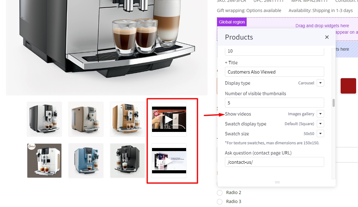
Video image product detail page
In Page Builder > Theme Styles > Products > Product Page find Show videos select tab or image gallery to change display video position.
Videos displayed in tab options:
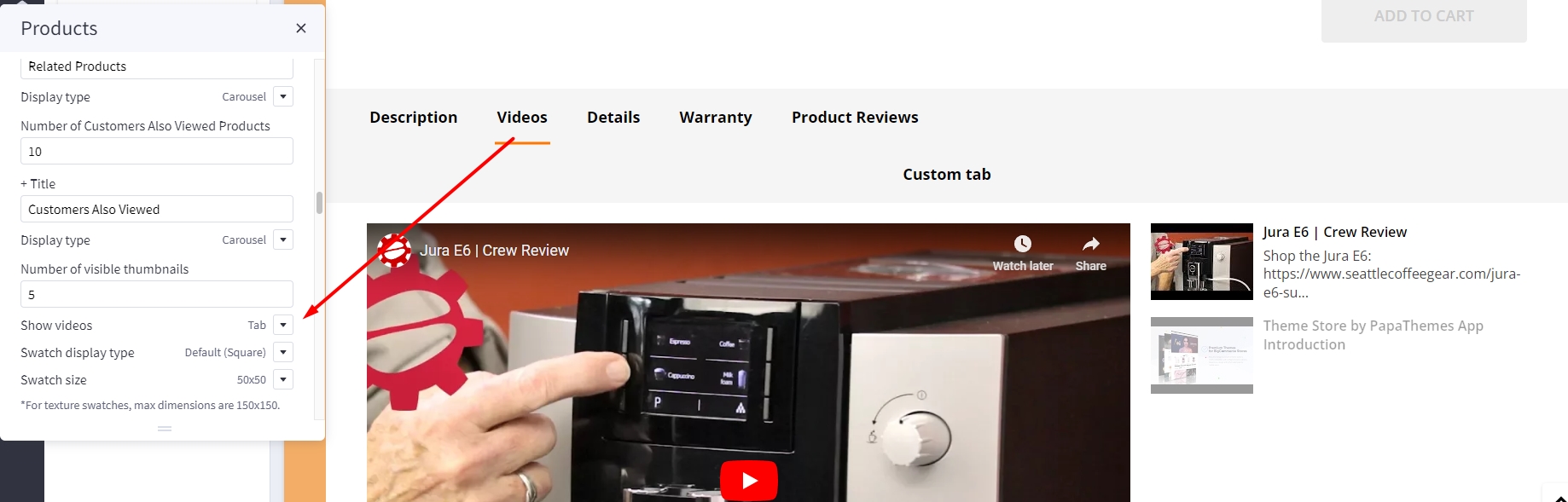
Videos displayed in image gallery option:
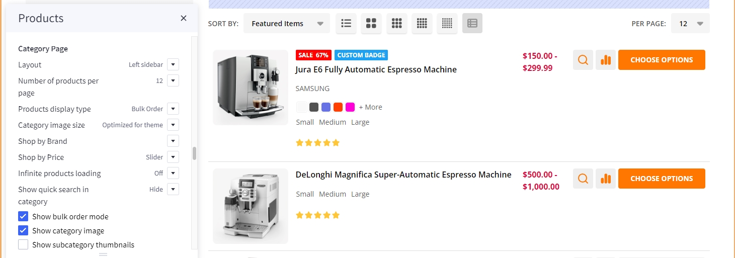
Customizing Category Pages
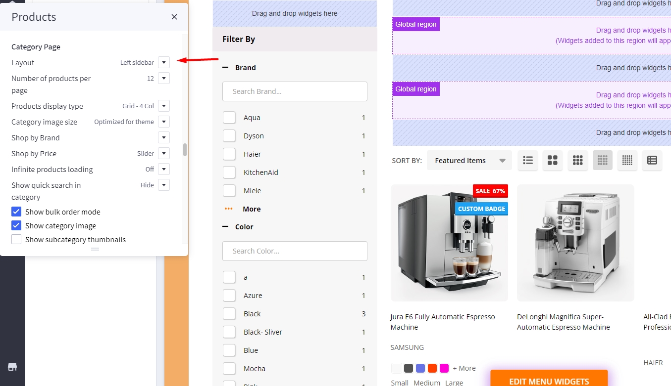
Configuring the category pages in Page Builder > Theme Styles > Products > Category Page.
Category Layout Type
Theme supports displaying category Page layout in Full width mode or Left sidebar mode. In Layout, select the particular display mode for default display.
- Layout =
Full width
- Layout =
Left sidebar
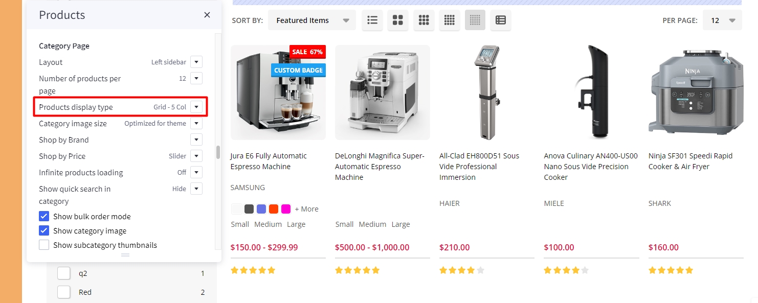
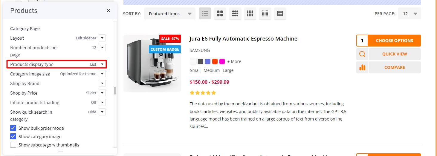
Products Display Type
Theme supports displaying products in grid mode (2, 3, 4 or 6 products per row), in list mode or bulk order mode. In Products display type, select the particular display mode for default display.
- Display type on the right allow your customers to change product category display by themselves.

Grid 5 columns:
List mode:
Display Bulk Order layout
To display this bulk order layout, select Products display type = Bulk order.
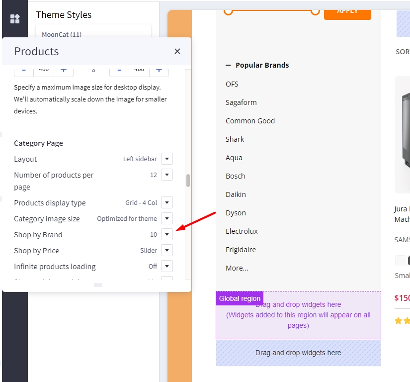
Displaying Shop by Brand
- Shop by Brand: Specifying number of popular brands to display.
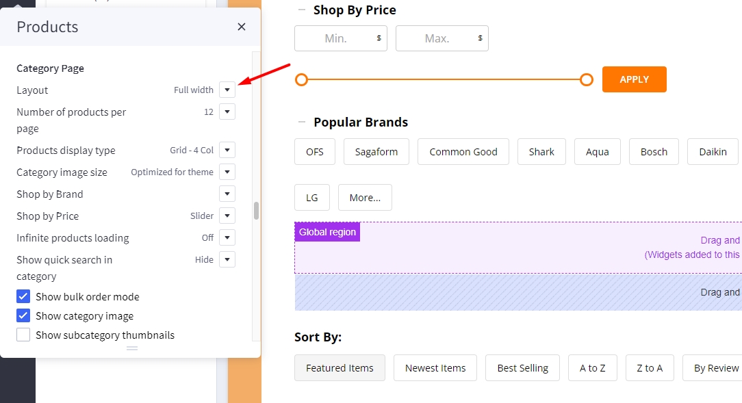
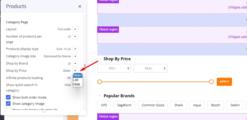
Displaying Price Slider
- Shop by Price:
Slider: Displaying the price slider.List: Displaying price list.Hide.
Infinite Products Loading
This feature allows you to choose the method of loading more products in the current catalog.
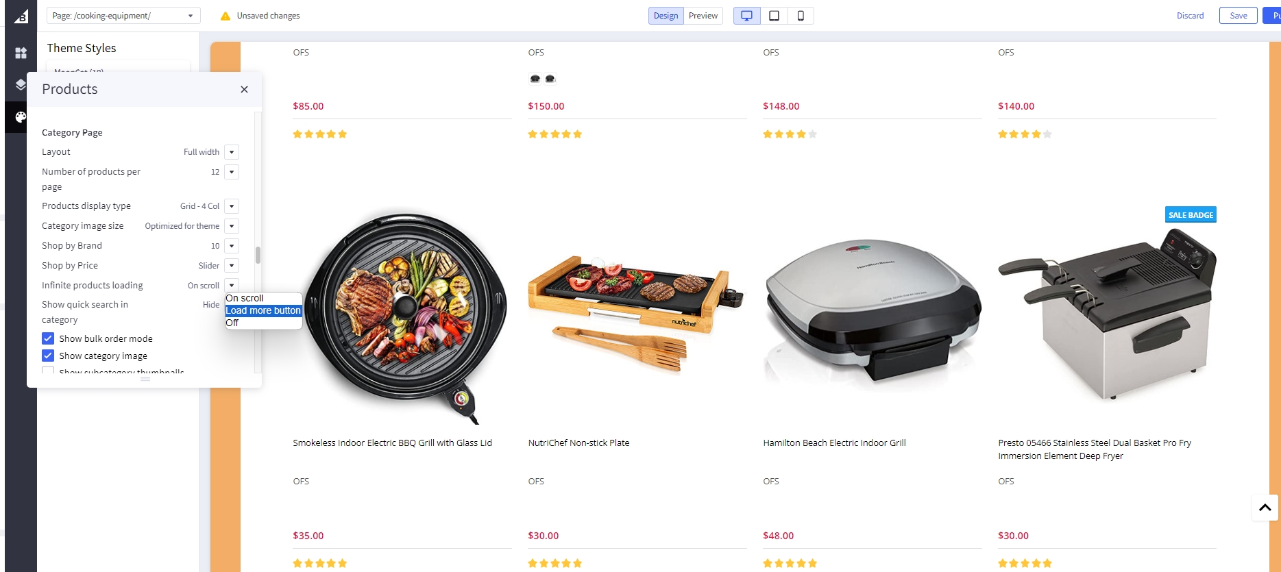
Infinite Products Loading:
-
On scroll: Products will automatic loadout when scrolling down. -
Load more button: Click on the Load more button to continue loading more products. -
Off: Show page numbers and arrow button as original. Click on button to see more products.
Display contextual search
This feature allows searching products within the current category and the current selected filter.
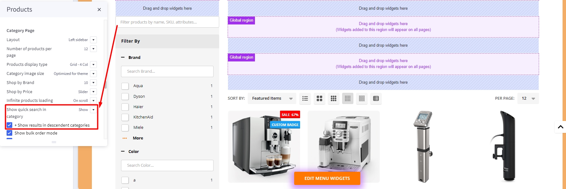
Select Show quick search in category = Show to enable it.
- + Show results in descendent categories: if selected, it also displays results in the descendent categories.
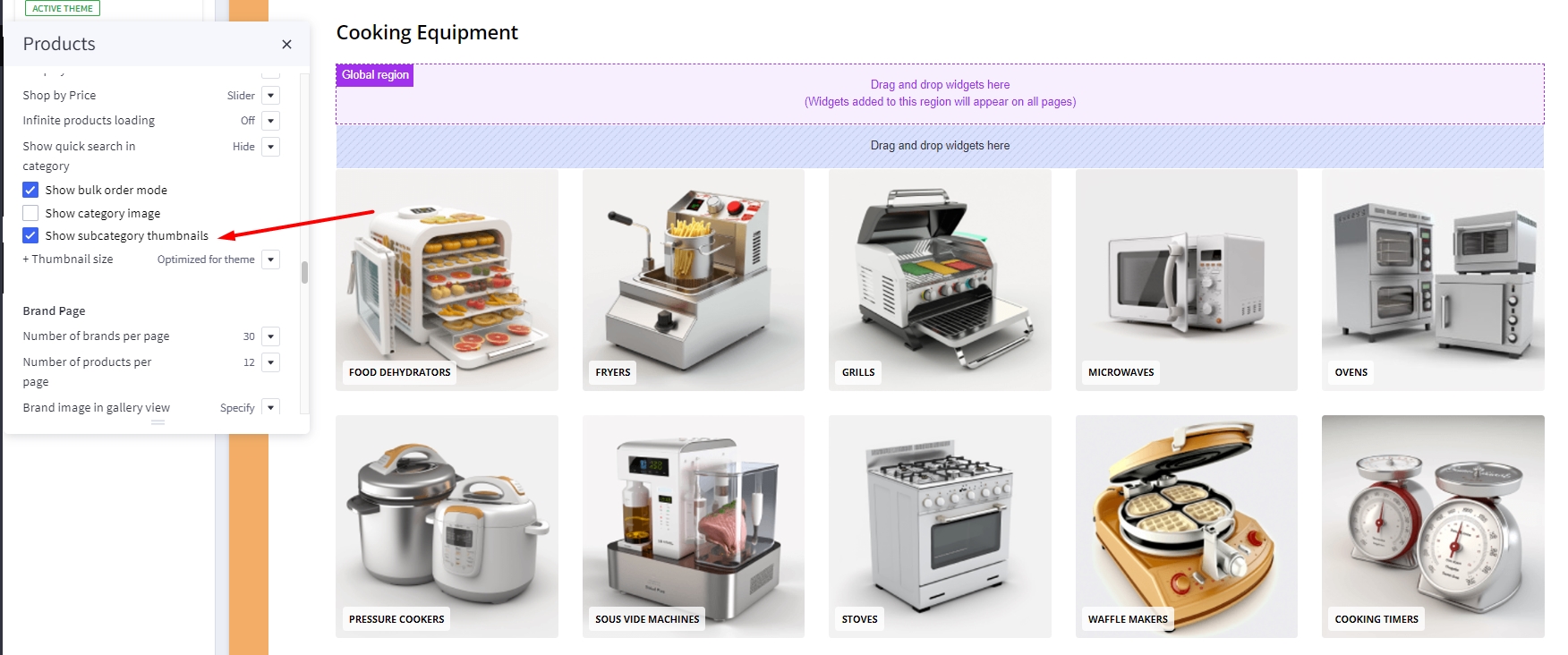
Display subcategory image thumbnails
This feature allow displaying subcategory thumbnails before products.
Select Show subcategory thumbnails to enable it.
Common Settings
- Number of products per page: Specifying number of products to display per page.
- Show category image: Displaying the category image or not.
- Show category description on AMP page: Displaying category description on AMP category page or not. If the category content contains images, the AMP page could be invalid. It's recommended to turn off this option.
Customizing Brand Page & Search Page
Configuring the brand page in Page Builder > Theme Styles > Products > Brand Page.
- Number of brands per page: Specifying number of brands to display per page.
- Number of products per page: Specifying number of products to display per page.
- Brand image in gallery view: Specifying the brand card image size.
- Brand image in brand page: Specifying the large image size displayed on the brand page.
Configuring the search results page in Page Builder > Theme Styles > Products > Search results.
- Number of products per page: Specifying number of products to display on the search results page.
Displaying brand quick-view introduction
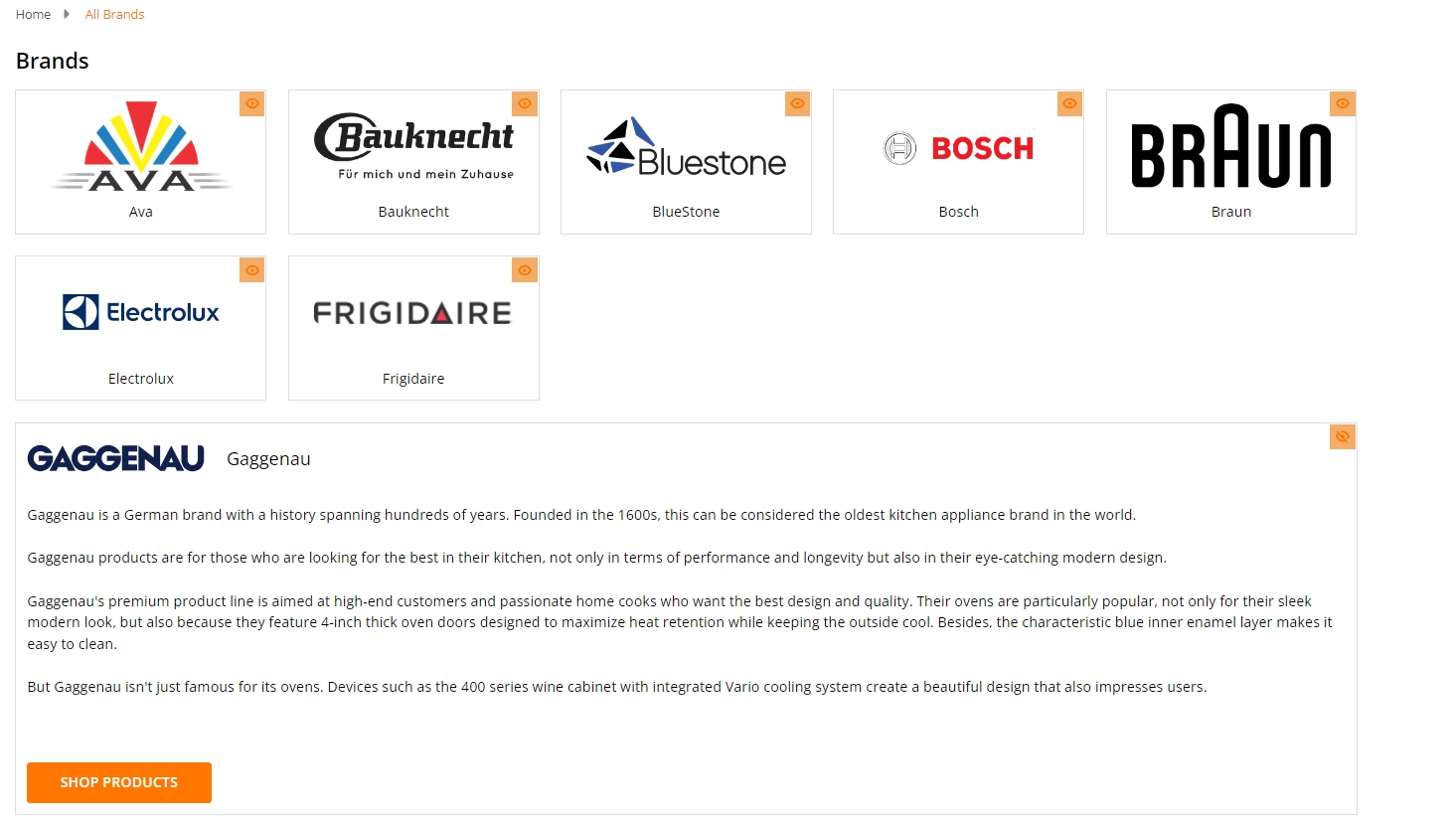
In Marketing > Marketing Banner, click Create a Banner button.
- Enter the brand introduction content to Banner Content.
- Select Show on Page =
For a Specific Brandand select the corresponding brand. - Select Location =
Bottom of Page. - Then click Save button to finish.
Watch the instruction video:
Customizing Cart page
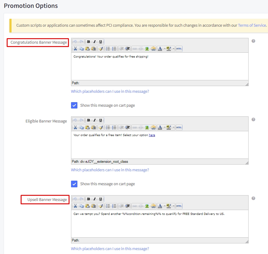
Display free shipping message in cart page.
Not qualify message
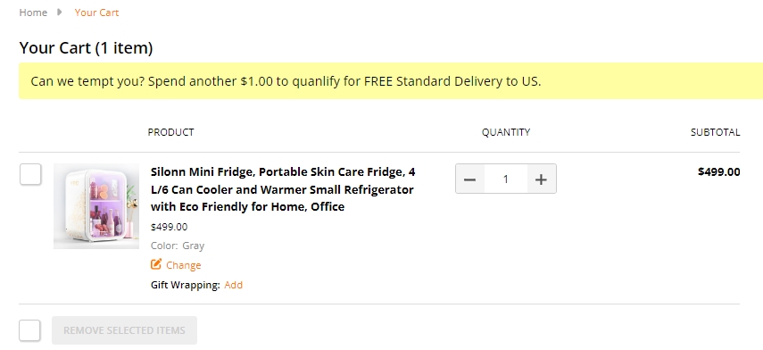
Qualify message
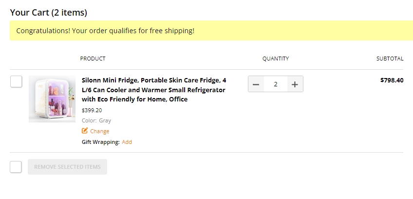
In Marketing > Promotion click on create and select With legacy editor
In Promotion detail name your promotion
In promotion type select Orders totaling more than X amount get free shipping to specific shipping zones at the field spend at least type your amount
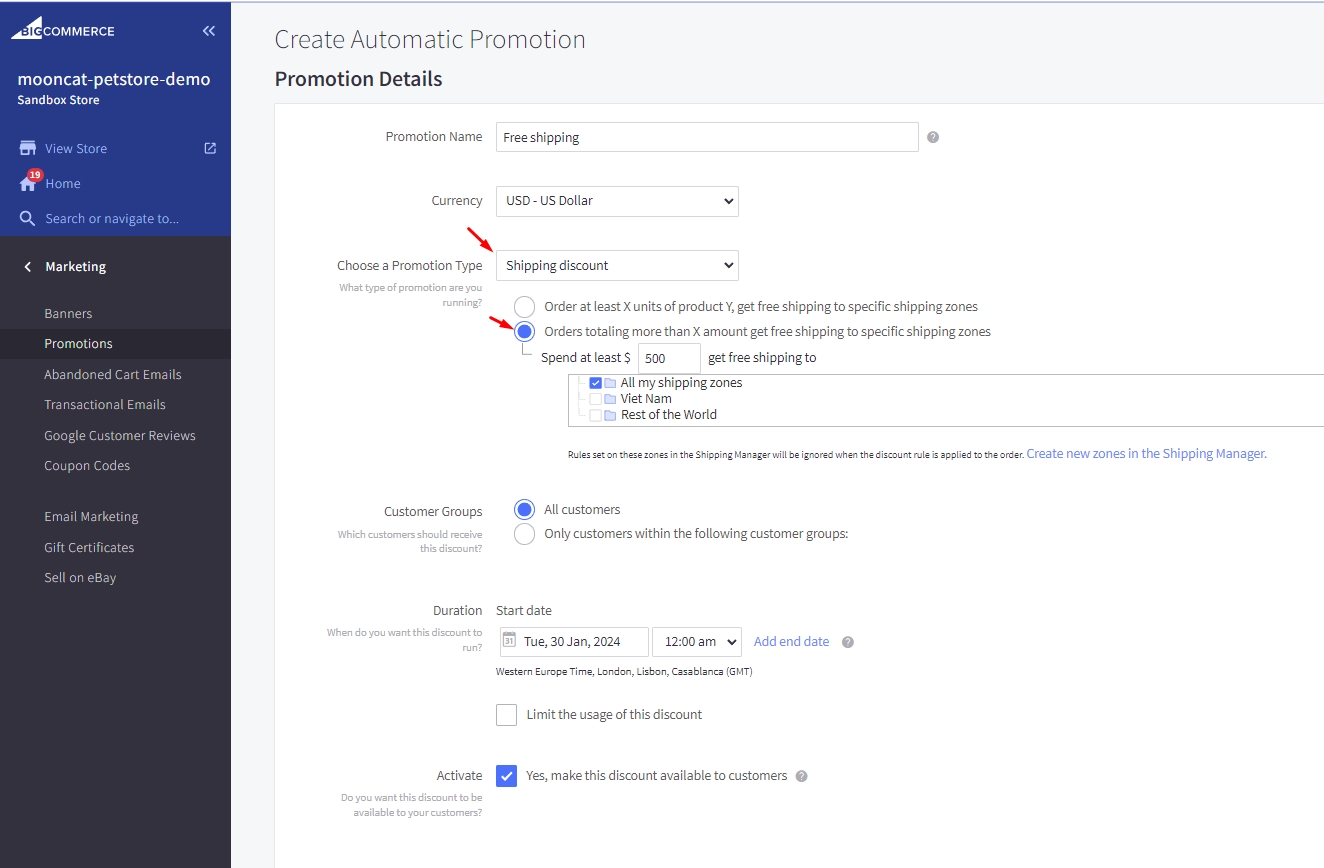
In Promotion option type your message at Congratulations Banner Message to display for cart have qualified and type your message for cart have not qualify at Upsell Banner Message with format [your text] %%condition.remaining%% [your text] then click save